Targets
Compare photographers across a project or within a piece of analysis. You could also create direct comparisons called: ‘Photographer and me” where you present a photo by you and a photo by your chosen photographer next to each other and discuss how you have been influenced.
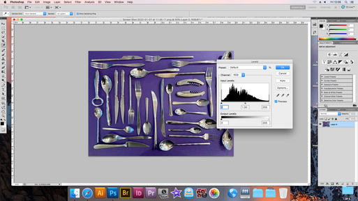
Screen grab editing techniques.
Screen grab editing techniques.
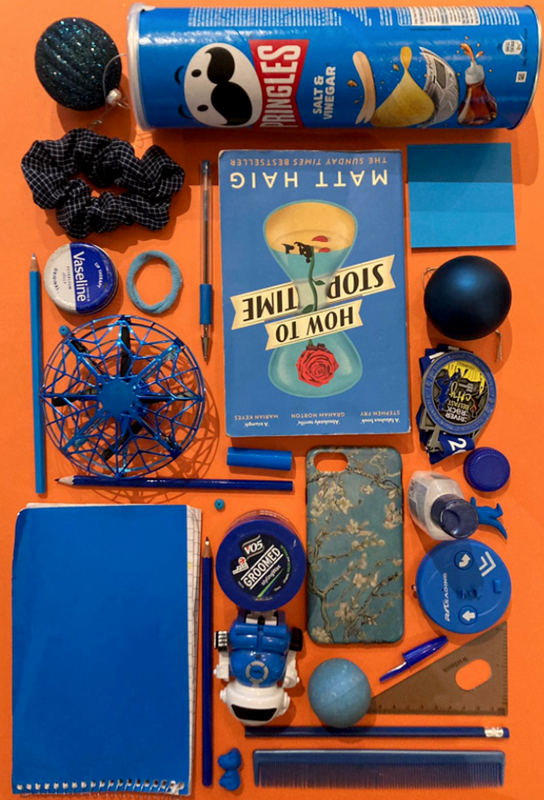
My pinterest board
try to screen grab your pinterest
First attempt
I went out and took photos that I thought linked to fragments without any prior planning to give me inspiration for my later sets. These are the images that I captured


The Photographers Gallery
Over the holiday, I visited the Photographers Gallery in Soho. The exhibition that was on at the time consisted of four floors of photos following themes of social media, video games, perspectives and identity.
Do you have images?
Do you have images?

|

|

|

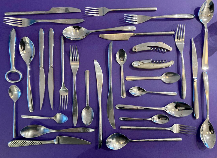
Stuart Haygarth


I was inspired by Stuart Haygarth over the summer holidays. He is a photographer who did a project in 2011 where he picked up the litter that he could find across the south coast of England. Then he sorted them into categories and photographed them on a background. He wanted to make a piece of art as well as open our eyes to the amount of waste that we have polluted the earth with, striving to help climate change through his photography. I replicated his style of photography using household objects.
My response
|
|
WWW: The colours are bright and eye-catching and the photos are well composed, the theme of fragments is portrayed through the different objects that tie together in a theme.
EBI: I could pay more attention to what I focus the camera on, as well as thinking about the artists intentions while taking the set of images
EBI: I could pay more attention to what I focus the camera on, as well as thinking about the artists intentions while taking the set of images
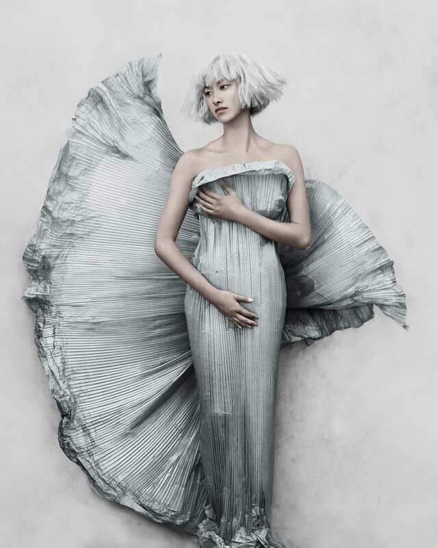
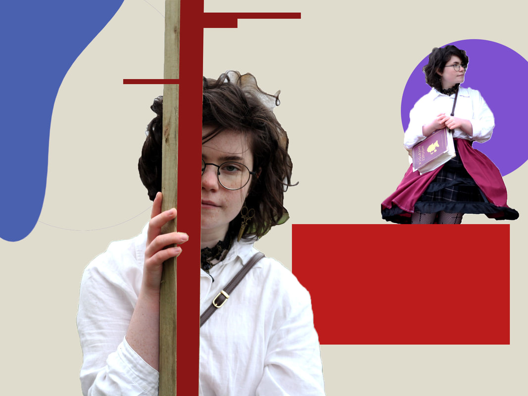
Fragments of identity
With inspiration from my first set, Pinterest board and gallery visit, I wanted to create a series of images that portray identity through objects, clothing and body language. With this in mind, I created characters through collections of objects and photographed them on a white background.


Best edits, www and ebi
Best edits

|

|
WWW: The images are well exposed and composed and the range of objects effectively portray a basic character
EBI: The white balance is too cold in some of the images
EBI: The white balance is too cold in some of the images
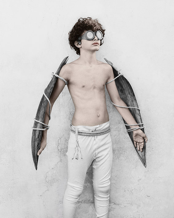
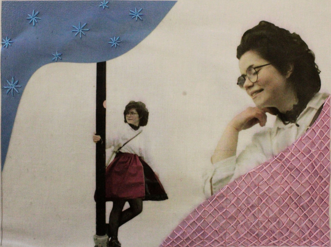
Vee Speers
|
|
Vee Speers is an artist who had her work in the photographer's gallery. She explores universal character traits such as childhood innocence, as well as deeply personal aspects like strength and adventure. I wanted to take a set of photos inspired by her work, to do this I organised a small group of models to wear an outfit that represented themselves well. They posed with dramatized expressions and stances, and I photographed them against a white background.
Editing experimentation

|

|

|
Best edits

|

|

|

|

|

|

|

|

|

|

|

|

|
WWW: I captured a range of clearly portrayed characters in my photos. I edited the photos well and pretty much all of them are in focus
EBI: The white balance and lighting colour is different for each subject, meaning the colours don't match with the other photos. This makes the images look more separate and less like a series.
EBI: The white balance and lighting colour is different for each subject, meaning the colours don't match with the other photos. This makes the images look more separate and less like a series.
Photographer

|

|

|

|

|

|
Me
|
|
|
|
|
|
|
Similarities: The composition is very similar, both mine and the photographers work are slightly over exposed and have not got too many bright colours
Differences: Vee speers uses predominantly clothing to portray identity whereas I used made facial expression and body language have just as much of an impact. Her work looks as if the clothes and background has been aged and worn down, everything kept in my photographs look as if it is new or well kept.
Differences: Vee speers uses predominantly clothing to portray identity whereas I used made facial expression and body language have just as much of an impact. Her work looks as if the clothes and background has been aged and worn down, everything kept in my photographs look as if it is new or well kept.
Collage
While I was looking for inspiration, I found a lot of collages border on surrealist art. I thought I would tie this into fragments of identity by tying together aspects of an identity in the collages. They start to paint a picture of who the person is, as well as making an overall complex, colourful and eye-catching image.

WWW: The colours and objects fit well together, the scene is busy and colourful and the shapes are abstract and visually pleasing.
EBI: some more subjects could be in black and white, also some photos are lower in quality than others and I could've put more thought into the composition.
EBI: some more subjects could be in black and white, also some photos are lower in quality than others and I could've put more thought into the composition.
Building fragments
- I need to ensure that my images are in focus
- I occasionally need to balance my exposure more
- I should keep a good ratio of empty space and building in my photos
- I have to keep my photographs as empty as possible, making sure that there are as little items in front of the building as possible
- I occasionally need to balance my exposure more
- I should keep a good ratio of empty space and building in my photos
- I have to keep my photographs as empty as possible, making sure that there are as little items in front of the building as possible
Cornillet
|
Cornillet paints plain and functional buildings whilst leaving out the background and parts of the structure. He does this to draw attention towards institutional buildings, usually made of concrete, that would typically be ignored. When I took a set of images inspired by his work, I tried to avoid having anything in the foreground, as well as using interesting perspectives in my photos and ensuring that it is well exposed and focused.
|

|


|

|

|

|
|

|

|

|
WWW: The photos have a painting like quality, they are cut out cleanly and the stamp tool has been used effectively. The images were well exposed and in focus
EBI: Some photos could be more central, a lot of the buildings are off the side.
EBI: Some photos could be more central, a lot of the buildings are off the side.
Mauren Brodbeck
This artist conceals plain, functional buildings with bright colours to prove how overlooked they are. It shows that even if we pass the building every day, we cannot remember what it looks like once it has been hidden.


Best edits

|

|
WWW: The shape selection is accurate and the buildings are central, the choice of structures is good because they are plain and forgettable.
EBI: I could've edited the background more, adjusting layers, etc.
EBI: I could've edited the background more, adjusting layers, etc.
Anastasia Savinova

|

|
Include images of her work and briefly outline her intentions.
This artist creates compilations of different buildings that portray the characteristics of the place. She called the series genius loci, after a roman belief that every place has a protective spirit; genius loci. It shows the general essence and memory of the place, while also creating a fantastical look to the final pictures.
|
|

|
www, ebi
WWW: The image looks as if it could've come from a fairy tale, it encompasses the kind of buildings around muswell hill effectively and nearly all the images are in focus
EBI: Some of the photos are not put together as seamlessly as they could've been. The background is a little too extreme and it does not reflect the essence of the area
Exhibition - Chris Killip
|
Chris Killip found his passion for photography when he was 17, in 1963, A year later, he got his first proper job in photography, as an assistant of Adrian Flowers, an advertising photographer who worked in London. From there he grew into a photographer in his own right. All of his work is in black and white, and he frequently uses layers in the composition of his photography. The subject is either central or on a third and it is/they are framed neatly by the edges of the image. He carefully chooses his subjects, models and backgrounds to reflect the political situation that he intends to capture.
He claimed that his photos record history "from the viewpoint of those who endured it". Most photos do exactly this, zooming in on people or places that have had history "done to them". The models have striking and powerful facial expressions or look directly into the camera, bringing the people to life in our modern-day world and allowing a connection to be formed between the viewer and the model. One aspect that stood out to me was how the people in the photos seemed to be hurt or upset, yet accustomed to the harsh environment that they are in. The scenes that he captured often depict contrasting scenarios, such as children playing in a very barren and poorly cared for environment. This elicits an emotional response from the viewer as they start to empathise with what it was like to live as specific people in these struggling time periods. One set of images that Killip took was in a village called Skinningrove, which at the time was facing mass unemployment. While he was there, he met someone called Leso, who made his experience there easier. Unfortunately, Leso passed away. Following this, Killip gave Leso's mother all the photos that he had taken of him. I think that this experience led him to title his photos with the subjects' names, as a way to preserve their memories in history, just as he did for Leso's family. |
|


Laura Williams
Laura Williams is a surreal photographer; she creates pieces that walk the border between reality and fantasy. She calls herself "a storyteller" as she creates unusual worlds through her art. A lot of her work utilises mirrors to hide sections of the subject's body, I tried to replicate this style of images in my first set.


WWW:
EBI:
in my second set, I made the photos my own by adding drama to them. I did this by using darker colours, as well as a more impactful outfit with bare, autumn trees giving the photo unusual shapes and colours surrounding the subject. I also experimented more with how I directed my model to pose, they generally had much more dynamic and natural compositions than the first set had.

Julie Cockburn

|

|

|
Julie Cockburn uses intricate embroidery on old photographs to give them a new life through bright colours and delicate shapes. She embroiders landscapes and portraits, a significant amount of her work uses circles of embroidered block colour that look as if they're floating into the distance, or are hiding aspects of the subjects face to draw attention to certain features. The overall effect give the images a striking contrast between colourless old photos and new colourful thread, causing the images to be extremely pleasing to the eye.
I wanted to respond to her art, so initially I found a photograph that I already had on my camera to practice her embroidery techniques on. This links to the theme of fragments by adding fragments of colour to the dull photographs, as well as patching out fragments of the subjects.
I wanted to respond to her art, so initially I found a photograph that I already had on my camera to practice her embroidery techniques on. This links to the theme of fragments by adding fragments of colour to the dull photographs, as well as patching out fragments of the subjects.
First response

This taught me a lot about how to embroider, in the second response I want to fill in the shapes better, as well as making a larger number of smaller circles on a less colourful image. I also want to move onto portrait photography. However, I was proud of the colour selection that I used, and the circles are placed well around the photo.
Second response


I used various methods in photoshop to make the images look older than they are before printing them out
|
For this photo I added a black and white filter layer, then flattened the image and added a 'warming filter (LBA)' at around 25%. Finally, I adjusted the levels so that the image was lighter as if it was slightly over exposed, I added noise and decreased the image size to get the image to how it is shown.

|
I initially made 2 layers of this photo and deleted the background of the top layer. On the bottom layer I added a 'Sepia' filter at a high percentage, on the top layer I increased the saturation and lowered the opacity to about 50%. I then merged the layers and made the photo significantly lighter in the layers tab. Using the dodge tool, I made the image look worn by adding lighter corners and edges, as shown in the result.

|
Embroidered pieces
I embroidered these images, focusing on the bright colours that I use. In the photo on the right, I used cool colours to stand out against the slightly warm hue of the photograph and emphasise the bright circles in the old looking image. In the image on the left, I blended the colours using various colours of thread to create a veil like effect.

|

|
WWW: I think the final effect of both images is very colourful and pleasing to the eye. The embroidery was good, the thread colour choice was very fitting to the images and the style and I think the edited images before the embroidery effectively made the images appear aged.
EBI: Some of the stitching in the circles does not fill in the colour as much as I would like, also the ink became scratched after the images were printed, removing some of the detail. In my next set, I want to use a printer that allows the ink to remain stationary.
EBI: Some of the stitching in the circles does not fill in the colour as much as I would like, also the ink became scratched after the images were printed, removing some of the detail. In my next set, I want to use a printer that allows the ink to remain stationary.
Evgeniy Shvets
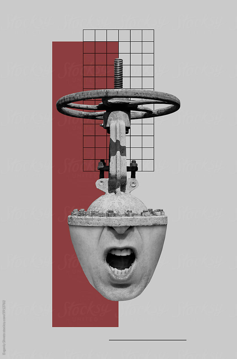
|
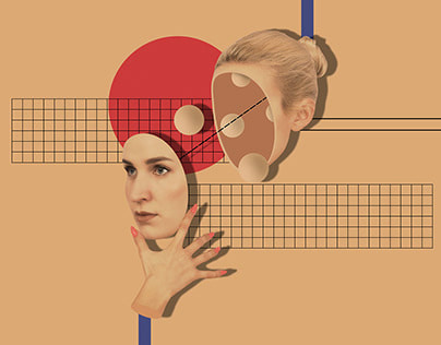
|
|
Evgeniy Shvets makes surreal collages of photographs and colourful shapes. It makes the image seem as if it would fit into a dream. Through this, surreal art like this is thought to unlock parts of our subconscious brain through unusual and uncanny imagery. I want to combine this with my recent embroidered pieces by sewing together the different elements of the photos. As well as making images that simulate subconscious scenarios, in this set I want to continue to explore how certain fragments of personality can be portrayed through the abstract shapes and colours.
Edited
|
Embroidered
|
WWW: The final image is well balanced and resembles the artist's work
EBI: The image was more colourful, perhaps printed onto coloured fabric or sewed onto coloured card
EBI: The image was more colourful, perhaps printed onto coloured fabric or sewed onto coloured card
Transgender joy
I took a set of images based on the style of Evgeniy Shvets but focusing on them representing transgender joy. I want to show through this set of images that trans people can and deserve to feel happy in their own identity. I did this by photographing Teddy (they/he/it), a non-binary person looking fantastic whilst just being themselves, and I put these in a collage. As a transgender person myself, I think this is important as it lets trans people know that they have a place in this world and an amazing community where they are welcomed.


I made a few collages in photoshop, then printed a few off to embroider them.
Manny Robertson

|

|

|
Manny Robertson is an artist that uses multiple photos on top of each other to show how people with mental illnesses and disorders use masks to hide behind. His series represents the breaking down of that mask and exposing the individual's colours and personality underneath.
I wanted to try to replicate certain styles that he uses to portray the less joyful feelings of being transgender. I want to show through this set of images how damaging it feels to be transgender in a world where so many debate our existence, and the complex feelings around doubting your fundamental identity so severely. This art piece will show how transgender people aim to live peaceful lives without conflict and yet are confronted with so much disrespect. It shows how some of us cope by turning on our own community and how we are unjustly forced to hide away in the shadows just to avoid the bombardment, behind a mask of which we pretend that we are like everyone else, as if we have grown up the same way as the other people of our gender and portray ourselves as exactly what a man or woman ‘should be’ because that's the only way we can make people believe who we are. As well as this we hide in groups with other transgender people who help us to ignore everything thats against us. That is what I want to make this for, to show other transgender people that we are hiding together in the hopes that one day we won’t have to. This links to the theme of fragments because of the fragments of ourselves that we are forced to hide, and the fragments that we want to show.
I wanted to try to replicate certain styles that he uses to portray the less joyful feelings of being transgender. I want to show through this set of images how damaging it feels to be transgender in a world where so many debate our existence, and the complex feelings around doubting your fundamental identity so severely. This art piece will show how transgender people aim to live peaceful lives without conflict and yet are confronted with so much disrespect. It shows how some of us cope by turning on our own community and how we are unjustly forced to hide away in the shadows just to avoid the bombardment, behind a mask of which we pretend that we are like everyone else, as if we have grown up the same way as the other people of our gender and portray ourselves as exactly what a man or woman ‘should be’ because that's the only way we can make people believe who we are. As well as this we hide in groups with other transgender people who help us to ignore everything thats against us. That is what I want to make this for, to show other transgender people that we are hiding together in the hopes that one day we won’t have to. This links to the theme of fragments because of the fragments of ourselves that we are forced to hide, and the fragments that we want to show.
Embroidery


|

|
Final Piece
