Christmas task
Stuart Haygarth
I was inspired by Stuart Haygarth for my task over the Christmas holidays. He is a photographer who did a project in 2011 where he picked up the litter that he could find across the south coast of England. Then he sorted them into categories and photographed them on a background. He wanted to make a piece of art as well as open our eyes to the amount of waste that we have polluted the earth with, striving to help climate change through his photography.
My response
I took my own versions of Stuart Haygarth's photos as shown below.
Best edits
I took two of my favourites and edited them in photoshop.


|

|
WWW: The colours are bright and eye-catching and the photos are well composed
EBI: I could pay more attention to what I focus the camera on
EBI: I could pay more attention to what I focus the camera on
Form over function
André Kertész

Kertész was an artist from Hungary. He was drawn to Paris and that was where he created his famous photo; Fork, in 1928. He made this simple, and focused on the composition of the photo, emphasising the forks geometry and form. He intended to identify the real nature of things and the beauty from the truth. He had a limited knowledge of the French and English language, this lead to a growing feeling of loneliness inside him. He channelled this into an emotive charge for his photography, giving his art a deeper meaning.
Henri Cartier-Bresson stated that "Each time André kertész's shutter clicks, I feel his heart beating." I think he meant that every photo Kertész took was a part of him, and helped him to live a better life using the photos.
Henri Cartier-Bresson stated that "Each time André kertész's shutter clicks, I feel his heart beating." I think he meant that every photo Kertész took was a part of him, and helped him to live a better life using the photos.
My response: Set one


Best edit

Set two
What did you learn from the first set that informed the second set?
The first set taught me that the images look nicer and represent the artist more if I focus on the beauty of the object as opposed to focusing on the shadow alone. I took this knowledge to my second set of images and tried to improve them based off it


Best edit

WWW: I think I followed Ketész's philosophy effectively in the second set and showed the real beauty in these domestic objects
EBI: I need to make sure the photos are focused on where I want them to and adjust the depth of field based on the image I am taking
ebi: Depth of field perhaps?
EBI: I need to make sure the photos are focused on where I want them to and adjust the depth of field based on the image I am taking
ebi: Depth of field perhaps?
Ordinary to Extraordinary
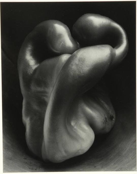
Edward Weston
|
Weston took abstract images that make ordinary objects look unusual because he wanted to show unique details and, much like Ketész, identify the beauty in everyday objects. He developed a sort of language through his photos, making them seem special and individual. These ideas were communicated through high apertures and very long shutter speeds. He used a graflex camera so he could see his subject matter in full size before taking the photo. However, the aperture only went down to f64 so he added his own pinprick opening that he called f240. This allowed him to get the entire object in focus, but it also meant that the exposure ended up being 4-6 hours. Over this time, the natural light shone on different parts of the pepper as it moved.
|
|
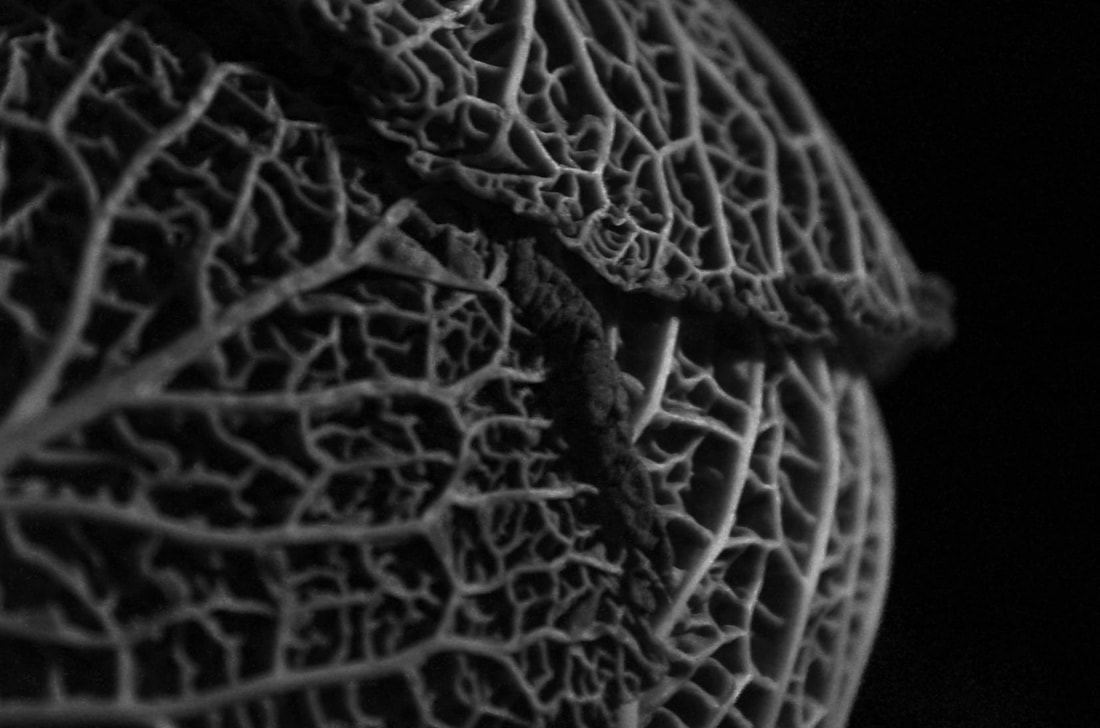
My first response (natural light)
I tried to take interesting photos of certain vegetables based on Weston's work, I used natural light to take these images.
Best edits:


|

|
WWW: The photos look abstract and unique because of the shallow depth of field that I used, they capture Weston's photography because of this individual beauty in each photo. I also composed the images in a more unusual way, overall improving the picture.
EBI: If I used a larger aperture my pictures would have a larger resemblance to Weston's and communicate more of the prettiness of the objects.
EBI: If I used a larger aperture my pictures would have a larger resemblance to Weston's and communicate more of the prettiness of the objects.
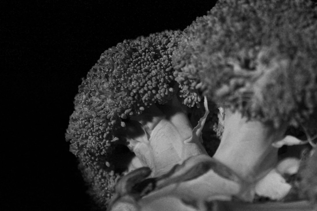
My second response (artificial light)
We retook photos based off Weston's work but this time we used an artificial light and slightly under exposed the images. I wanted to identify the different textures of the subjects in the images because of the successful images in the first set that put a focus on the texture. This made them more connected to Weston's art as showing the textures was one of his main intentions.
Second set best edits
|
|
www and ebi
WWW: The majority of my photos were slightly under exposed without just showing a black image. The subject's form are identified easily and make the objects stand out when they would usually blend in.
EBI: Some of the images are not focused correctly and do not reveal the details that I would like them to.
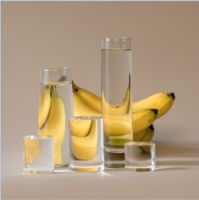
Suzanne Saroff
|
Saroff takes images of ordinary objects with vessels of water and glass cylinders infant of them. The refraction of the light exagurates the form of the subjects making the photographs abstract and original. TO FINISH
|
|


Homework task
We were asked to take pictures replicating the style of Kertész, Weston or Saroff. The images taken by Kertész inspired me so I wanted to take my photo's based off his work.
WWW: My pictures have a subtle beauty that makes them appeal to the eye and stand out from all the others.
EBI: Some of my photos are slightly out of focus or slightly under exposed.
EBI: Some of my photos are slightly out of focus or slightly under exposed.
David Hockney's photo joiners
Cubist artists such as Pablo Picasso intended to capture subjects from multiple perspectives. They usually used paints to make abstract cubist art to show more of objects than what our eye would usually see. when we look around his work, our viewpoint shifts, giving a unique and interesting twist to his images.
David Hockney based his work largely on these cubist artists but used photography to put it together. He blurred the line between photography and painting as he adjusted and put together his images. He wanted to photograph things as we would see them, so in his collages you can see the pass of time as well as the range of perspectives. When taking the photos, he got close to the subject to make an attempt to draw the viewer into the pictures instead of the viewers feeling detached from it as is the case in most images.
The fundamental difference between Hockney and other cubist artists is the intentions behind their artworks. Where cubist artists wanted to show many perspectives at once, Hockney aimed more to replicate how we see in his photos.
Hockney joiners, my response - Object
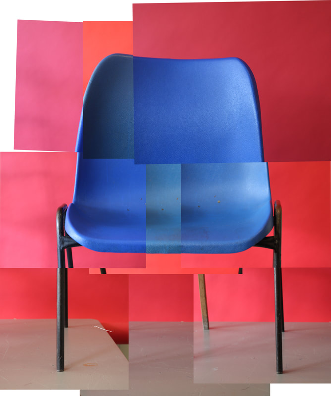
My image
|

Hockney's image
|
WWW: The photos transition smoothly, making the overall image visually pleasing and well composed. Each individual photo is in focus and well exposed. The fragmented image plays with how we view the world, much like Hockney.
EBI: The colours are a range of shades which remove from the togetherness of the picture.
EBI: The colours are a range of shades which remove from the togetherness of the picture.
Hockney photo joiners, my response - Person

My image
|

Hockney's image
|

|

|
Hockney photo joiners, my response - Room
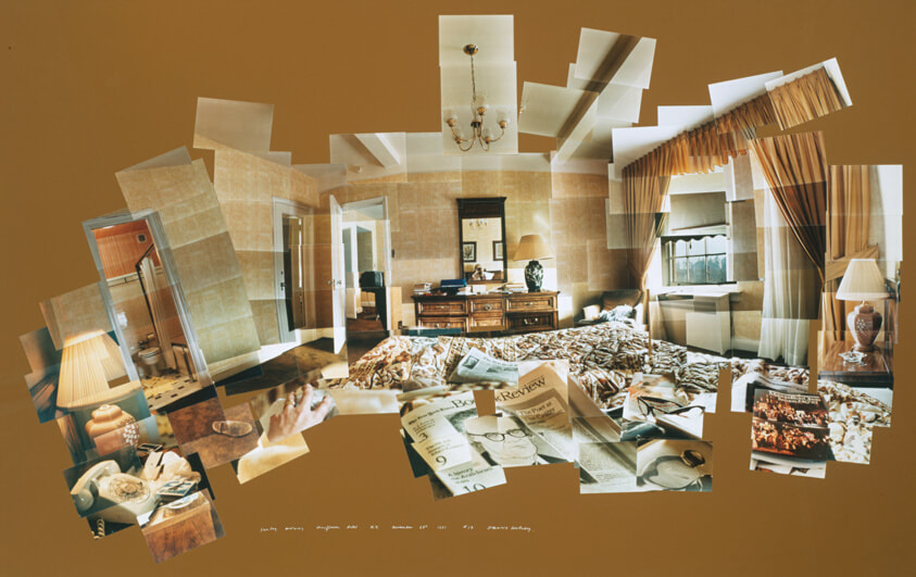
Hockney's image

My image
WWW: The images are put together nicely and make the room visually appealing as well as capturing the style of Hockney's images
EBI: A background colour would bring together the image more and give it a visually apealing finish
EBI: A background colour would bring together the image more and give it a visually apealing finish
Eating sequence
Page
|
|
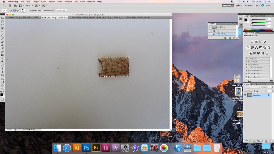
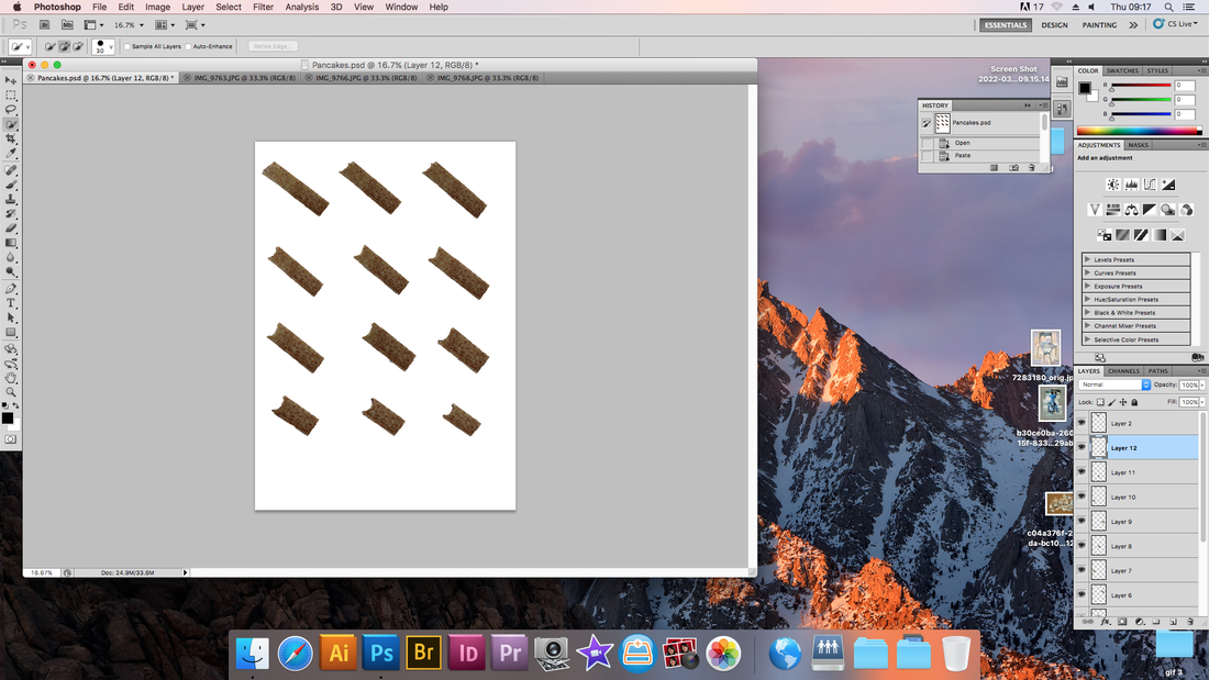
I made this image in photoshop by going through the pictures I had taken after each bite of a chocolate pancake and selecting the pancake with the quick select tool, I then copied and pasted them all onto an A4 page and adjusted their size, rotation, brightness and contrast.
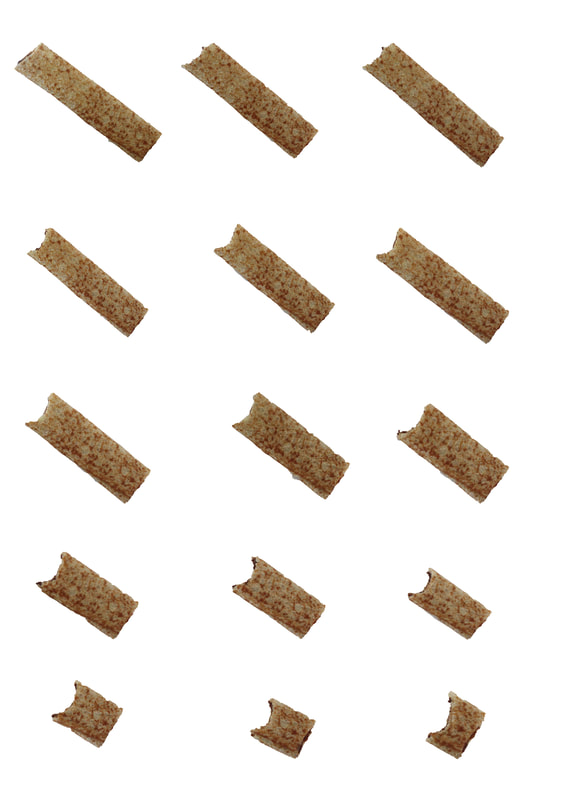
WWW: The brightness and contrast is good and you can see a clear progression in the sequence as you look through the image.
EBI: The sizes of each component are not completely uniform, removing from the aesthetic appeal of the image, I could have fixed this by using rulers and guidelines while adjusting them.
EBI: The sizes of each component are not completely uniform, removing from the aesthetic appeal of the image, I could have fixed this by using rulers and guidelines while adjusting them.
Gif
I made this gif by putting each photo of an apple being eaten into frames on the animation tab. I adjusted the brightness and contrast, as well as image size, to make my gif look the best it can be.
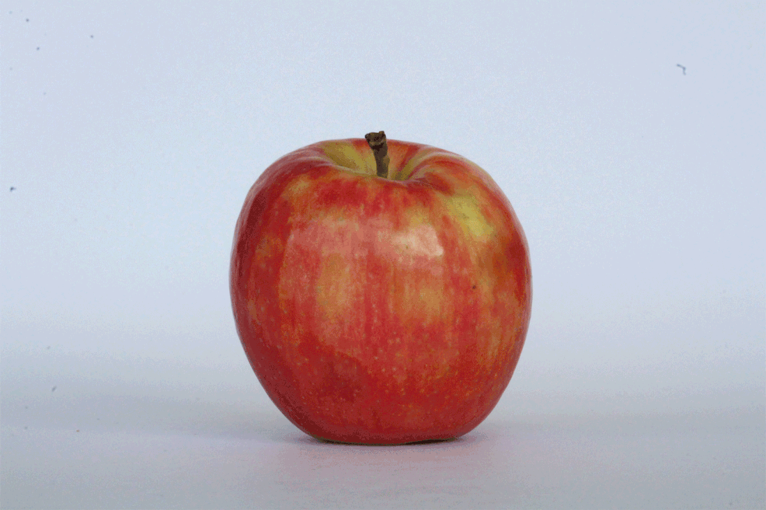
WWW: The images are well composed and in focus, they are also positioned similarly, making the gif look smooth and visually appealing
EBI: The timings could be adjusted to make the gif slower, this would make each step more visible and also make the gif look less shaky. Furthermore, when taking the photos we could have taken more bites of the apple to elongate and progress the gif more
EBI: The timings could be adjusted to make the gif slower, this would make each step more visible and also make the gif look less shaky. Furthermore, when taking the photos we could have taken more bites of the apple to elongate and progress the gif more
Alberto Seveso


65 peanuts! Homework gif

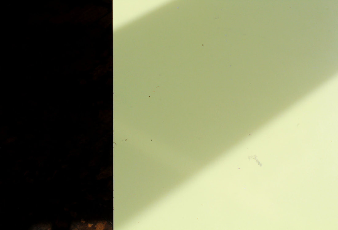
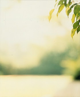
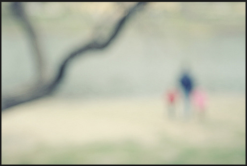
Uta Barth - Light & Focus
Uta barth encourages us to consider our perspective of the world and become aware of our perception of images. She does this by taking slightly out of focus images where the subject is on the edge of the photo. Barth's images contrast to classic expectations of a good image, yet still includes bright colours to intrigue and catch the eye of her audience, leading to the viewer questioning what a good photograph should include. The pictures also resemble how people see the world around them. All of her images are taken in her house, giving the viewer a sense of familiarity, and they represent how often when we see, we do not focus on specific things and often don't have a well composed picture of the world. This shows how Barth prompts her audience to contemplate and compare their depiction of the world with her images.
Barth also uses light to create surreal shapes as the subject of her images, giving her images painterly qualities. She obscures the simple light to make a visually appealing image and the simplistic display reminds us of different things that we have the ability to see beauty in. She said that "the camera taught me how to see" which suggests that when she started taking photos, she started to see the potential in simple, colourful images with light projected onto them in simple spaces such as her house. Her images portray freedom, as they do not stop at the limits of good composition and the light and shadows add to this with the huge variety in shapes that the light adds to the image.
Barth also uses light to create surreal shapes as the subject of her images, giving her images painterly qualities. She obscures the simple light to make a visually appealing image and the simplistic display reminds us of different things that we have the ability to see beauty in. She said that "the camera taught me how to see" which suggests that when she started taking photos, she started to see the potential in simple, colourful images with light projected onto them in simple spaces such as her house. Her images portray freedom, as they do not stop at the limits of good composition and the light and shadows add to this with the huge variety in shapes that the light adds to the image.
My response - blur
I took simple, colourful images in response to Uta Barth. Each image I took is in focus and slightly out of focus in pairs.
Best edits
|
|
WWW: I have taken pictures with colourful and out of focus objects that are not composed to good classical standards
EBI: I could make some images simpler with less objects in frame and added multiple colourful objects on the edge of the picture
EBI: I could make some images simpler with less objects in frame and added multiple colourful objects on the edge of the picture
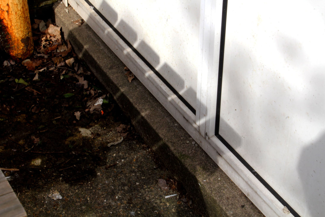
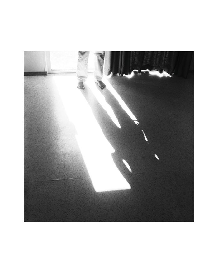
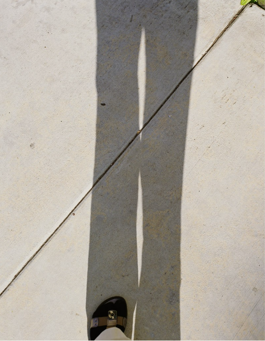
My response - shadow
I took photos with light and shadow as their subject in response to Uta Barth's work.
Best edits
|
|
WWW: I took well composed photos with interesting shadows taking up the page. The accents of colour add depth and individuality to the images
EBI: Some of the photos do not have obvious shadows and light, I also could fill the page with colour instead of only adding hints of colour
EBI: Some of the photos do not have obvious shadows and light, I also could fill the page with colour instead of only adding hints of colour
Independent work
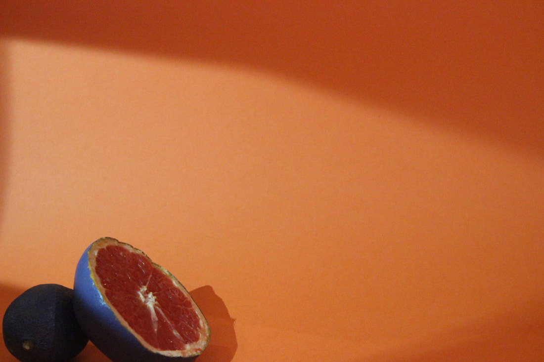
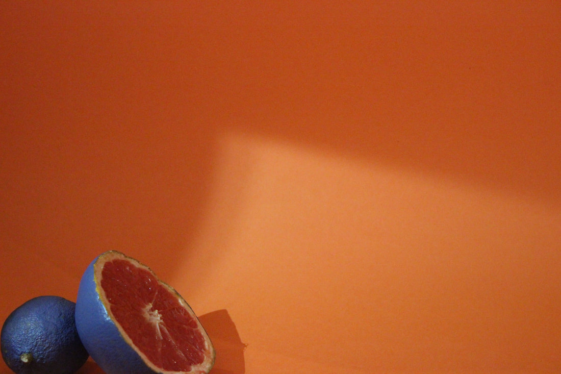
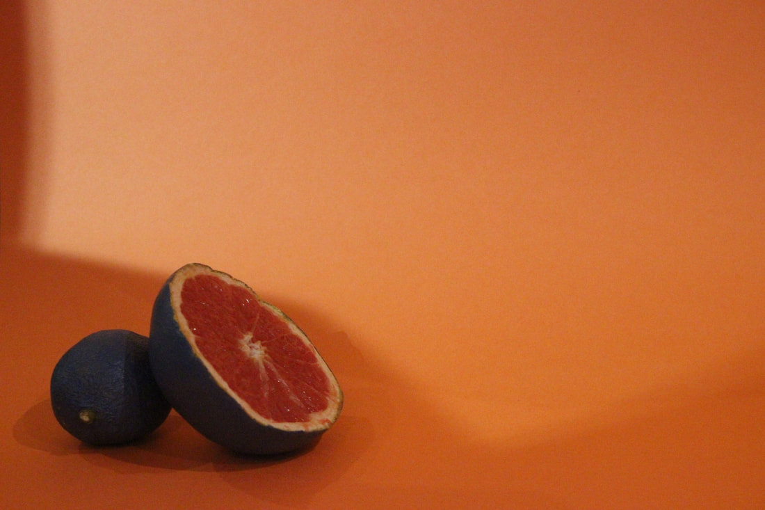
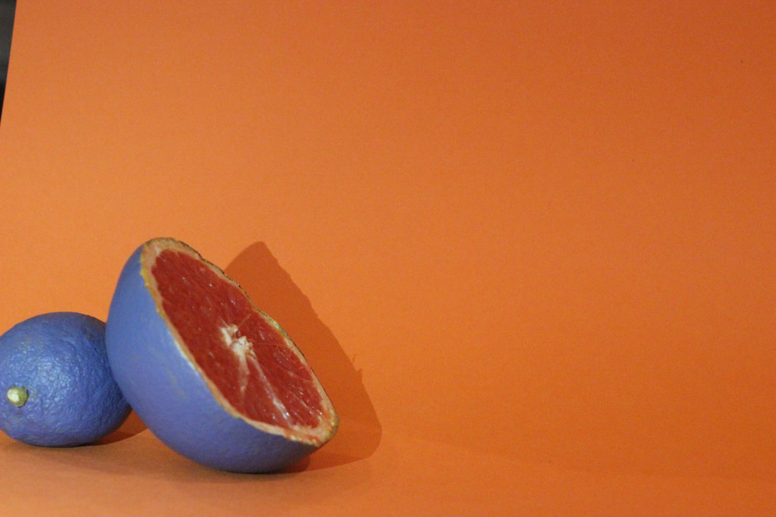
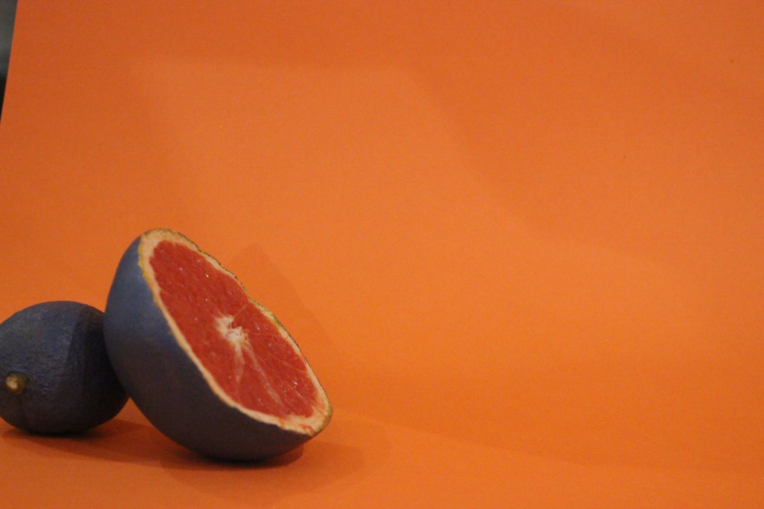
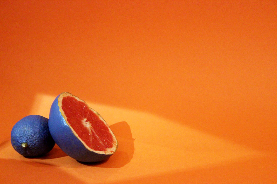
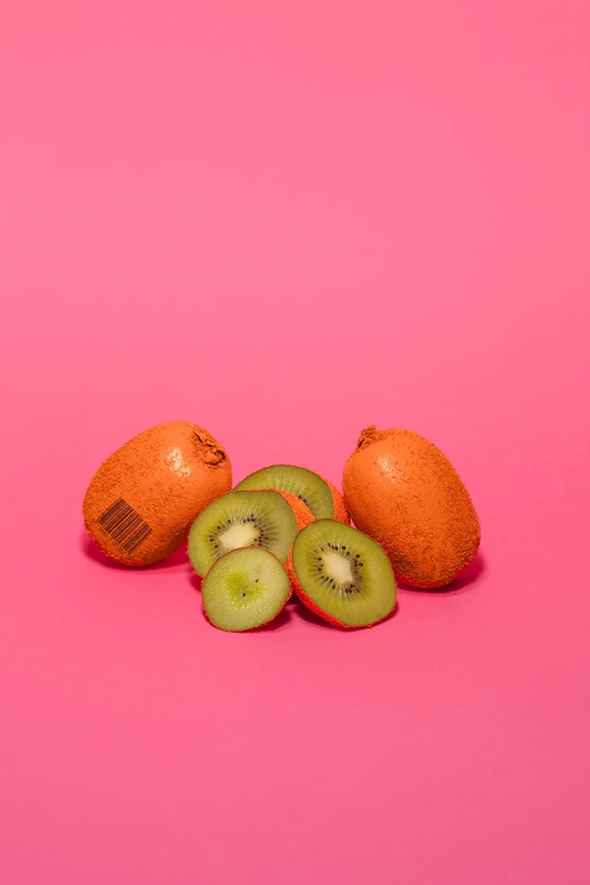
For our first independent project, I wanted to combine the work of Uta Barth, who takes uniquely beautiful images that challenge the limits of good photos, with Enrico Becker, who takes pictures of fruits with high saturation, or painted parts of the fruit to create eye catching and peculiar pictures.
Enrico Becker
Enrico Becker paints unusual colours onto his photo's subjects, he also puts a bar code onto some of the fruits because of his belief that brands tell great stories. Some of his photo's show modified fruit to make it look surreal and intriguing His style is simple and eye catching and he likes to convey stories through his photos. His photo's merge his german heritage, which is where he was born, and his current life in Sydney. I want to take the colourful and surreal features from his work and envelop it into my my own photos

|

|

|

|
Uta Barth
Uta Barth, as I have written in my previous topic, takes pictures that try to push the boundaries of good photos. Her pictures use aspects such as light, shadow, blur and unusual composition. She takes photos for the audience to become aware of and question their perception of her pictures. I want to utilise her use of strange shapes from light and shadow, aswell as making my composition of colourful objects unusual, as she does with her images.
|
|

|
|
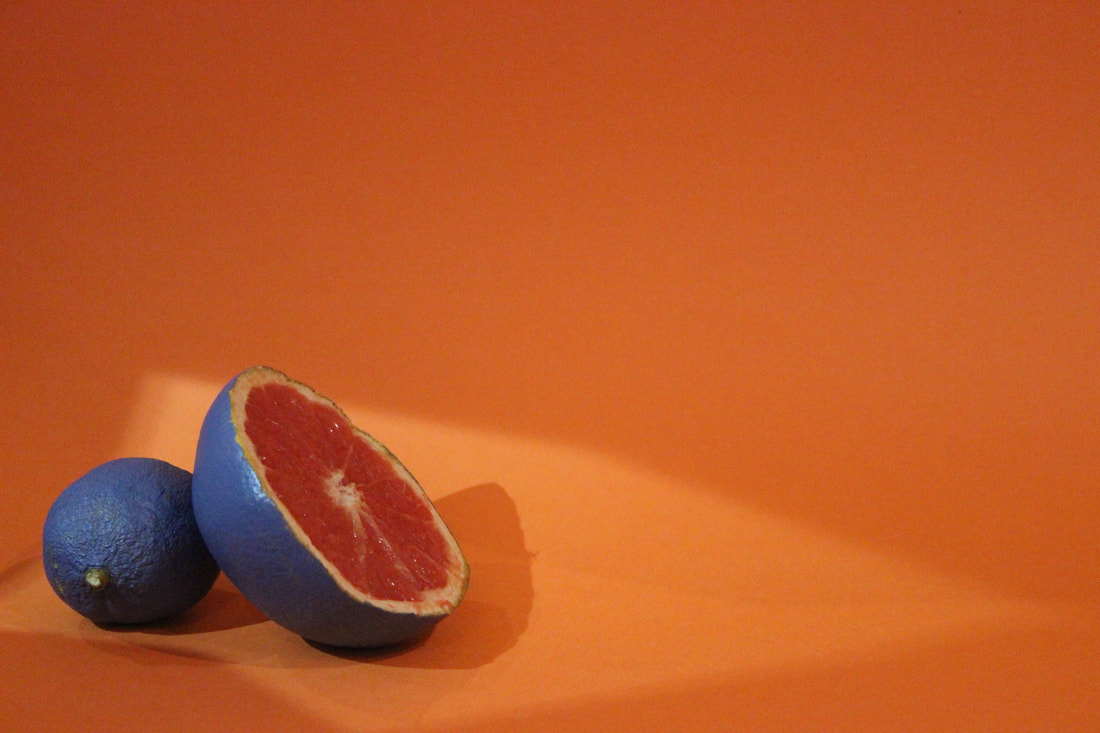
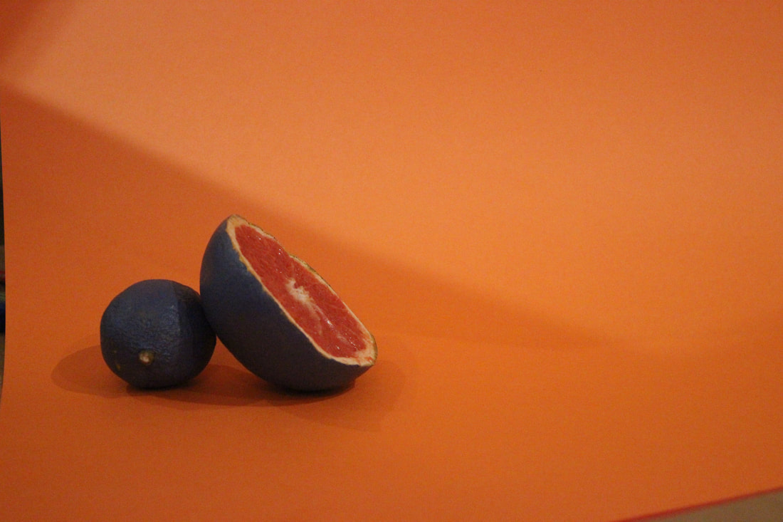
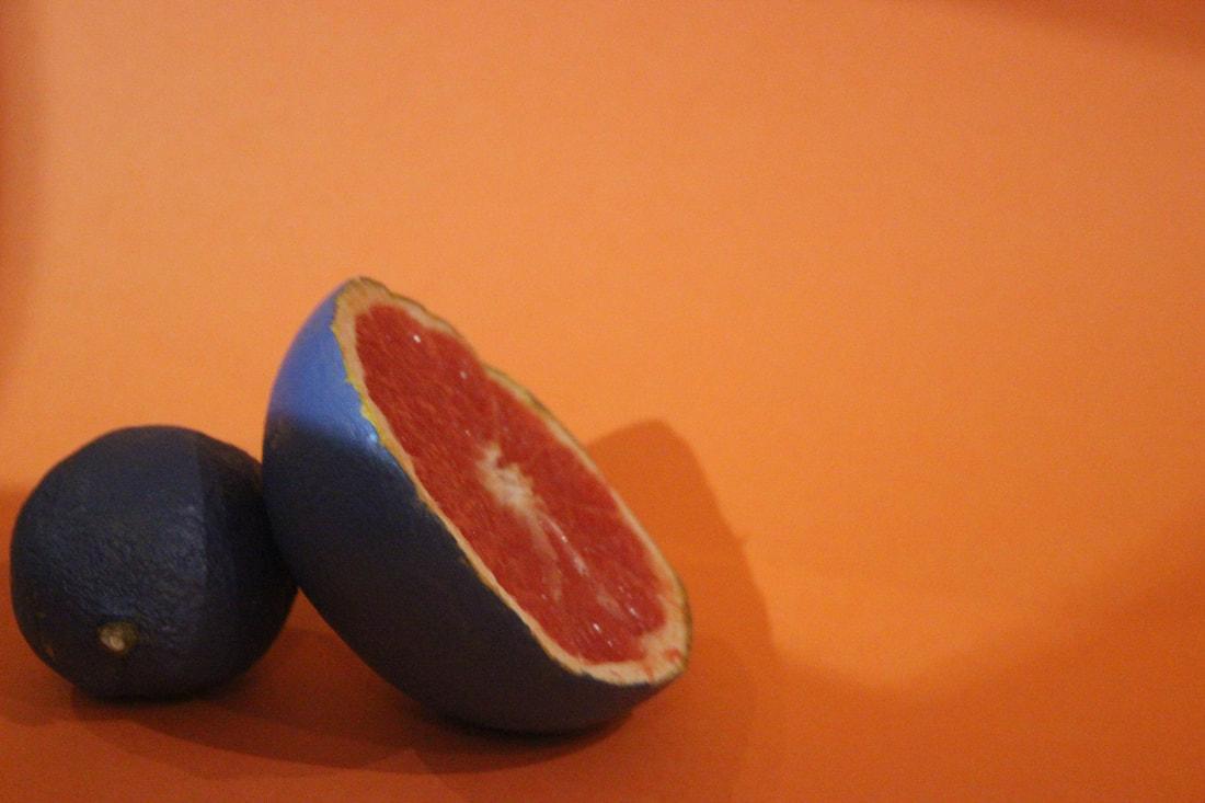
My first attempt (unedited)


I was inspired by the two images seen above and wanted to use an unusual composition to capture light and shadow in the background of uniquely coloured fruits. My unedited set are shown below.
|
|
|
|
|
|
|
|
Best edits

WWW: There is a nice balance of complementary colours and I have been able to merge components of both my chosen artists without them clashing. The overall photo is visually appealing with interesting shapes and colours that make it stand out.
EBI: I need to pay more attention to the composition of the subjects, some of the photos are unintentionally out of focus which I should control more. I also would like to take a larger group of photos so I can have a larger selection when I choose my photos to edit.
For my next set, I'd like to incorporate a larger variety of fruits and try to experiment with focus, as Uta Barth did with her photography. I want to keep the strange colourful elements from Enrico Becker and the interesting shapes from light and shadow from Uta Barth.
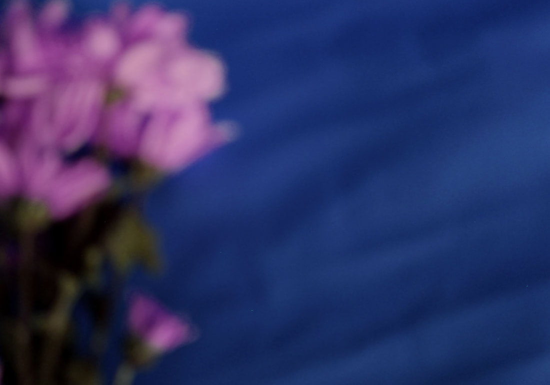
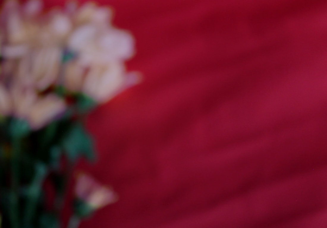
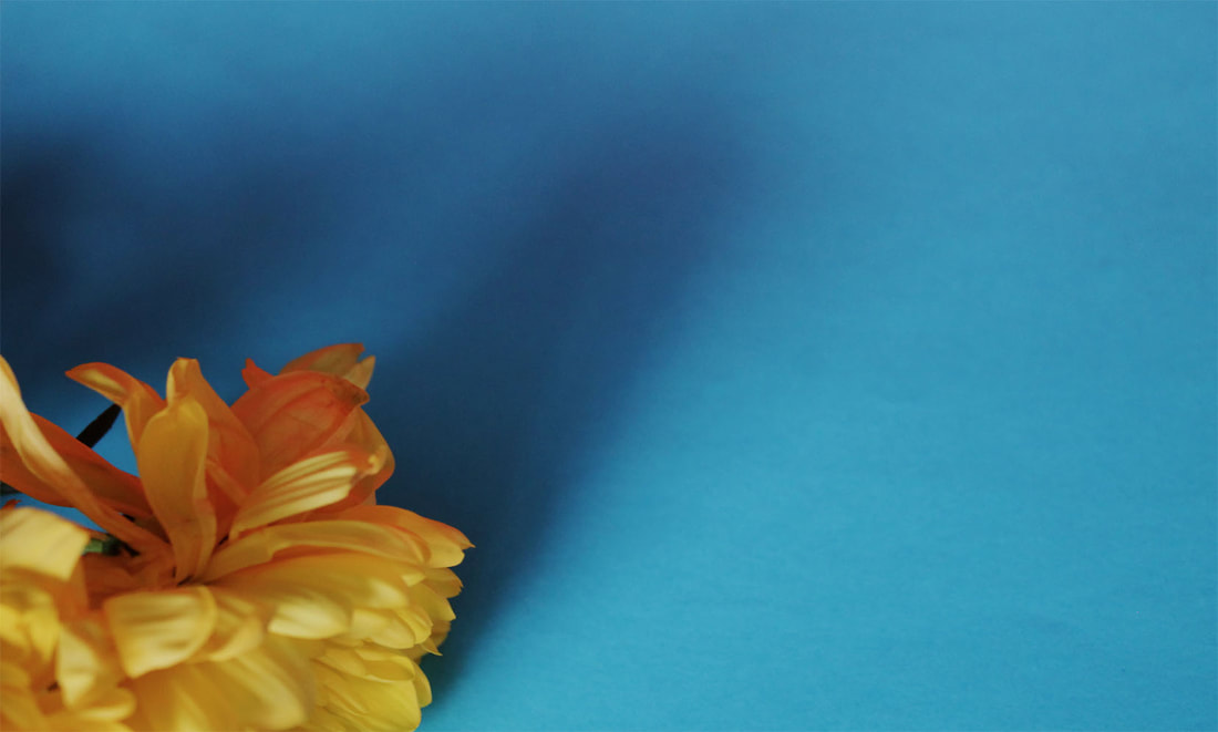
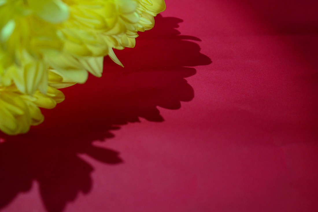
My second attempt (unedited)
|
|
|
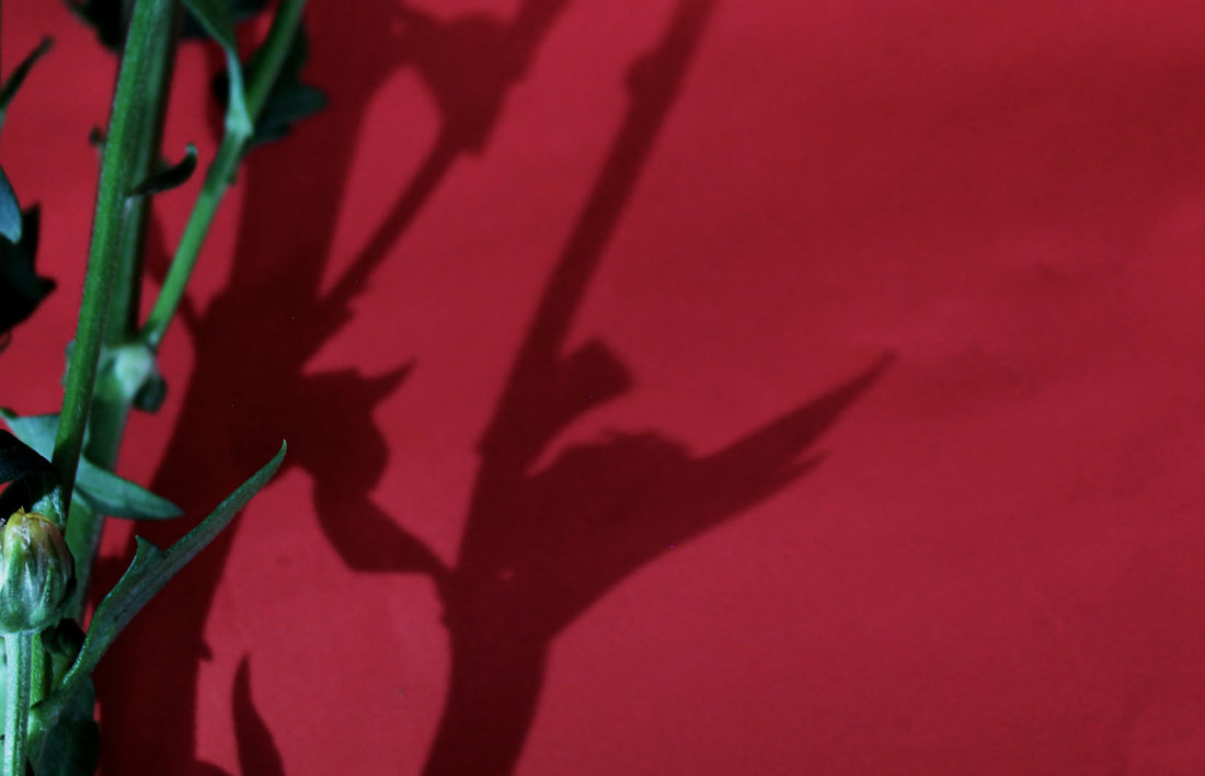
Using the pictures above as inspiration, I photographed flowers on coloured paper for this set of photos, the majority are based on the shadow, but near the end I take a few that blur the flowers. I feel like the ones that experiment with focus resemble Uta Barth's photos closely, and I want to edit the hue of the images on photoshop to capture Enrico Becker's work. The images that I took are shown below


Best edits

|
|
|
|
|
|
WWW: I used the change in focus to replicate Uta Barth's photos, making visually appealing and unique photos. I also adjusted the colours to make the photos more like Enrico Becker's work.
EBI: I should have adjusted the flowers before taking the photos to make them look like Enrico Becker's work without them looking unnatural. Also some of the photos' composition are not as I wanted them and do not work well with the rule of thirds, which Uta Barth uses frequently.
EBI: I should have adjusted the flowers before taking the photos to make them look like Enrico Becker's work without them looking unnatural. Also some of the photos' composition are not as I wanted them and do not work well with the rule of thirds, which Uta Barth uses frequently.
