Which theme did you choose and why? .
I chose the theme inside/outside because of the variety of ideas that can fit under the theme. I wrote a list of ideas for the three different themes and the inside/outside ideas really stood out to me as being enjoyable and creating excellent pieces.
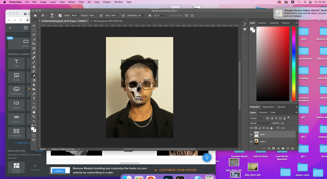
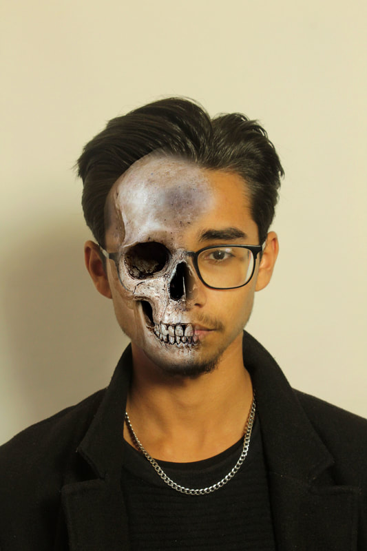
Class Task: Danny Quirk
I took a set of images inspired by Danny Quirk to start this project. He creates images that show people with part of their insides on show, I replicated this by using skull photos and portraits in photoshop.


Best edits

|
|
WWW: The skull is positioned well and looks proportional to the model. The portrait photos are well composed and the correct exposure has been used. The second edit is well done as the colours and shapes blend together well
EBI: The first edit could have brighter and more striking features, it currently looks slightly dull and washed out because I turned down the opacity instead of cutting parts of the image. I think the second would've been more interesting if I cut out the shape of the glasses and put them on the top layer to make the image more dynamic and layered
EBI: The first edit could have brighter and more striking features, it currently looks slightly dull and washed out because I turned down the opacity instead of cutting parts of the image. I think the second would've been more interesting if I cut out the shape of the glasses and put them on the top layer to make the image more dynamic and layered
I created a Pinterest board of general ideas and inspirations for the project. I then grouped these into 3 main starting points and made a mind map, collecting more specific ideas for the each starting strand.

Strand 1: Entrapment
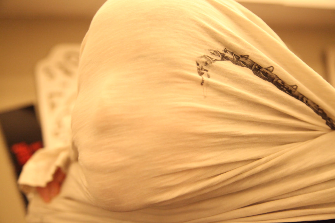
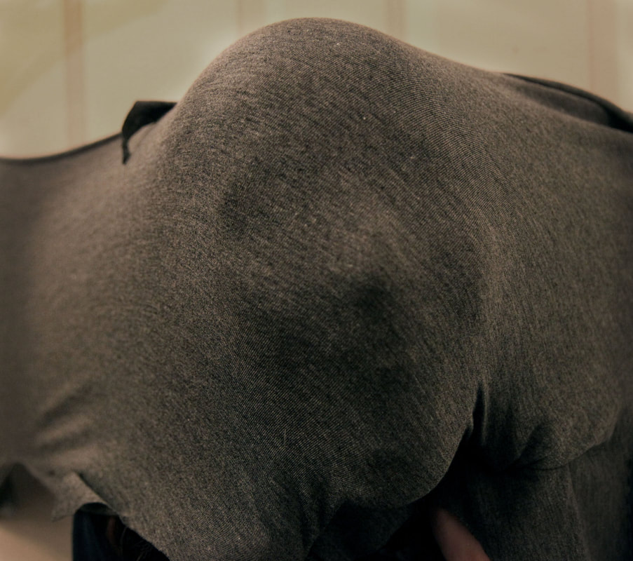
Luca Pierro
This photographer has a series named "portraits behind the canvas" which involves thin, elastic fabric in an old ornate picture frame. He wanted to "recreate the atmospheres of some horrific and surreal drawings and paintings".


|

|
WWW: A lot of the images show clearly defined features that seem ominous because of how the person is only partially revealed to the outside eye.
EBI: The white balance is not correct on most of the images and only some of the fabrics worked. The3 fabric should have been stretchier and suspended in a frame or something to gain better results.
EBI: The white balance is not correct on most of the images and only some of the fabrics worked. The3 fabric should have been stretchier and suspended in a frame or something to gain better results.
Strand 2: Box Dioramas
Allison May Kiphuth
Allison May Kiphuth is a painter who creates intricate yet simplistic dioramas that display outdoor scenes, typically filled with nature. The layered paintings give the pieces depth that immerses the viewer. For my first attempt, I took a series of photographs from the park and after editing them slightly and printing them out, I put them in an old ring box in several layers, with layers of card in between.


WWW: The images are layered effectively to portray an immersive scene that somewhat resembles the artist's work. All of the photos are taken and edited well.
EBI: I want to cut out the photographs more accurately, and fit the images in the box better.
EBI: I want to cut out the photographs more accurately, and fit the images in the box better.
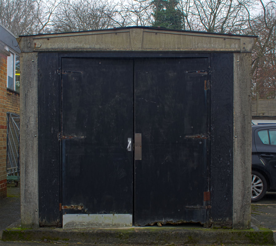
Strand 3: Entrances
Dennis Rainville
Dennis Rainville created a series of photos called 'doorways of Italy', in which he shows off the artistic hand crafted doorways of a small town in Italy. Inspired by the beautifully composed and painterly images, I took a set of pictures that explored the doors in my local area.


Rainville uses a technique in his photos that give them a painterly quality. He does this by taking each photo with multiple exposures and layering the on top of each other so that the colour and light range is larger than the cameras capabilities. I tried this using photoshops automated HDR function and photos from doors in school.
|
|
|
This doesn't appear to have the feel of HDR- do you need to have another go?
|
|
www and ebi
WWW: The doors are central and the edges of the doors are parallel to the edges of the photos. All the images are in focus and I used a tripod to ensure that all of the images used on top of each other were positioned the same.
EBI: The HDR technique did not add as much depth to the images as I had expected, perhaps my choice of doors was wrong to give the optimum painterly effect.
EBI: The HDR technique did not add as much depth to the images as I had expected, perhaps my choice of doors was wrong to give the optimum painterly effect.
My chosen strand is Box Dioramas
Alice in wonderland
I want to make a series of box dioramas inspired by famous fairytales. To do this, I got some of my friends to wear costumes of some of the characters from Alice in Wonderland and Little Red Riding Hood
I printed out the images, cut them out carefully and thought about where they would be placed before painting the inside of the box and painting some cardboard shapes for decoration. Then, I used a hot glue gun to stick in each component one at a time, suspending each with cardboard apart from the hearts, which I fed a string through and hung them in front of the scene.

|

|

|
WWW: It was effective in conveying the story, it was colourful and it suspended the photos well without making the supports too obvious.
EBI: It doesn’t have the same effect as the first one where it seems like the viewer is peeking in to see the scene. I want to incorporate this into my next diorama.
EBI: It doesn’t have the same effect as the first one where it seems like the viewer is peeking in to see the scene. I want to incorporate this into my next diorama.
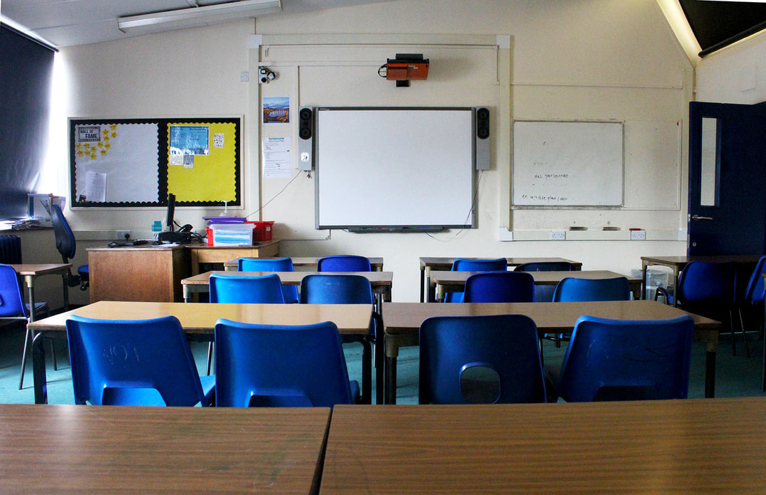
Classroom
I wanted to create a piece made up of several layers of the same picture to add depth and a sense of movement to the scene. To do this, I photographed an empty classroom as it has many layers.
Best edit
Assembled piece
I printed out this photo four times and glued them onto sheets of card. I then cut out each layer and stuck a strip of foam board onto the back before sticking each onto the previous layer.
WWW: the image is in focus and the layers are cut out neatly. If you walk past it or change your perspective the images move as if you are actually in the room.
EBI: I should have added larger gaps between layers so that the 3D affect if more obvious and dramatic. Also, I could have added more layers to make it even more dynamic than it is.
EBI: I should have added larger gaps between layers so that the 3D affect if more obvious and dramatic. Also, I could have added more layers to make it even more dynamic than it is.
You need another development here. Perhaps you could create a layered image of people in the classroom during the second exam day.
My home in a jewellery box
Having experimented with two different styles of dioramas, I decided that I preferred the first that used a compilation of different photos to make a specific scene.
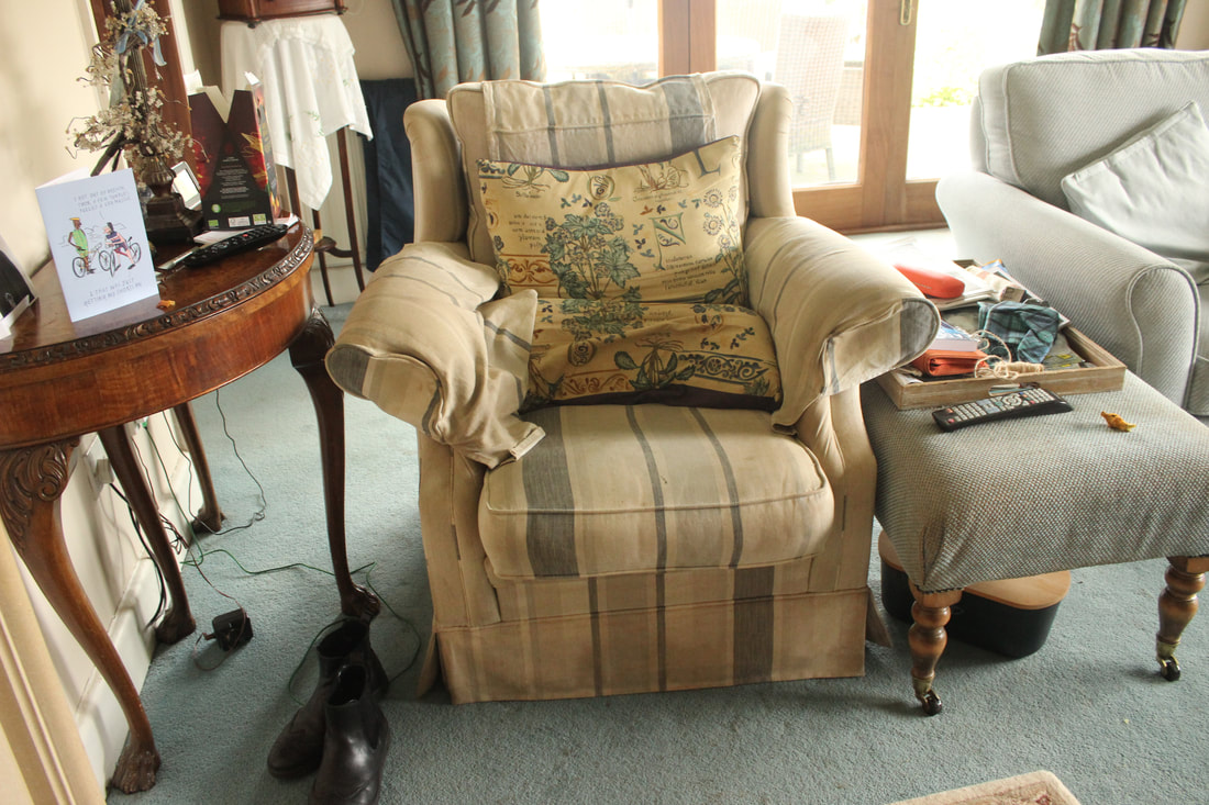
When searching for artists and inspiration, I came across a photographer called Tim Walker. The piece below is a box diorama that he has created, he also does larger scale diorama-type pieces but this stood out to me as it reminded me of a child's jewellery box. All of the patterns, animals and plants look like they represent a place. I wanted to create a similar piece, but one that represented my local area and all the things in it that are so familiar to me. To do this, I found a jewellery box and adjusted some parts so that I can stick photos into all of the sections. I then started brainstorming to come up with dioramas to fill the compartments with, I found an image on pinterest by the artist Audrey Kawasaki (image 2). I immediately wanted to create a similar diorama but incorporate some of the surreal aspects of Tim Walker's works, he commonly uses flowers, hands, stone statues and elaborate outfits in his photos (image 3).
When searching for artists and inspiration, I came across a photographer called Tim Walker. The piece below is a box diorama that he has created, he also does larger scale diorama-type pieces but this stood out to me as it reminded me of a child's jewellery box. All of the patterns, animals and plants look like they represent a place. I wanted to create a similar piece, but one that represented my local area and all the things in it that are so familiar to me. To do this, I found a jewellery box and adjusted some parts so that I can stick photos into all of the sections. I then started brainstorming to come up with dioramas to fill the compartments with, I found an image on pinterest by the artist Audrey Kawasaki (image 2). I immediately wanted to create a similar diorama but incorporate some of the surreal aspects of Tim Walker's works, he commonly uses flowers, hands, stone statues and elaborate outfits in his photos (image 3).

|

|

|
To decorate the outside, I used an image of a door on the lid and carefully cut out foam bricks to give the sides a textured brick wall pattern. I used the HDR technique on the door like in the same way as the doors in my 'entrances' strand.
|
|
|


Once this was stuck onto the front of the box, I finished covering it in foam bricks and painted them red. I left gaps around the hinges and clasp so that I would not effect the opening mechanic.
I chose to cover the box in bricks as it is a very familiar pattern to me and my home.
WWW: The bricks evenly cover the box and surround the door without blocking it. The paint is well saturated and the colour serves the 3D effect well. The door has the painterly quality that the HDR editing process should give and it is relatively central on the top of the box.
EBI: The door has some discolouration that would have occurred while it was being printed, or by an excess of glue that caused the inks to bleed. I could've added some shading to the bricks to make them look more realistic.
Main compartment
For the main compartment, I made a diorama of my room. I took pictures of the items in my bedroom, as well as some plants so that I can give the diorama some surreal aspects.
Before assembling the diorama, I removed the velvet interior that the jewellery box had and I the bare walls green, to match the colour of my room. I also added fabric to act as a carpet and used lollypop sticks painted white as the skirting board. I then used a glue gun to stick in the photos and finally put some curtains so that the viewer feels as if they are peering into the scene.

WWW: The images are sized nicely to fill the room and the bed is layered carefully so that the stuffed animals appear to be on it. The images are cut out neatly and there is little white space around most of them.
EBI: There is no main focus, nor is there a clear background, mid ground and foreground. Next time I will pay more attention to each individual photo to ensure that the white balance, composition and exposure is correct. I also did not include enough visible plants.
EBI: There is no main focus, nor is there a clear background, mid ground and foreground. Next time I will pay more attention to each individual photo to ensure that the white balance, composition and exposure is correct. I also did not include enough visible plants.
Compartment 2
For this compartment, I photographed a road near me, I took a few different places to assess which would be best fit for the diorama. To improve from my previous diorama, I wanted to focus on 3 parts, the background, midground and foreground. I planned to make a map as the background, with a row of houses in front, then (like Tim Walkers diorama) have hands reaching inwards in the foreground.
Best edit

WWW: I adjusted the perspective well in photoshop and very carefully edited out the sky to make it easier to cut out when it is printed
EBI: There are dots of light on the photo, there are also a few things in front of the buildings, for example the car and traffic light
EBI: There are dots of light on the photo, there are also a few things in front of the buildings, for example the car and traffic light
Map
For the background, I wanted to have a map of my local area. I took a few photos of an ordinance survey map, some more zoomed in and some less.


Best edit
I chose the more zoomed in image as I like the level of detail that is visible. On photoshop, I made sure to increase the brightness significantly as the original image was under exposed.

WWW: The section of the map has a wide variety of features and looks busy without being too distracting. Lots of detail is visible and it is very obvious that it is a map, causing it to serve as an interesting and effective background.
EBI: It is slightly out of focus and the grid lines, as well as the names, are not directly horizontal and vertical. I should have rotated the image anticlockwise.
EBI: It is slightly out of focus and the grid lines, as well as the names, are not directly horizontal and vertical. I should have rotated the image anticlockwise.
Foreground
To give this diorama the same style that Tim Walker uses, I used hands to frame the scene in the foreground.
Best edits |
|

|

|

|
WWW: The images are cut out nicely and are interesting shapes that will suit the slightly surreal diorama. All of the images are in focus and well exposed.
EBI: The original images were grainy and with very little vibrance, because of this they required quite a lot of editing. Also, half of the image had a hand with jewellery on it which ruined the effect a little and therefore weren't used.
EBI: The original images were grainy and with very little vibrance, because of this they required quite a lot of editing. Also, half of the image had a hand with jewellery on it which ruined the effect a little and therefore weren't used.
Compartment 3
This diorama consisted of indoor furniture in an outdoor location


Best edit

WWW: most of the edges are cleanly cut out and the colours suit the scene as it has a slightly green tint. I used a wide variety of subjects so I could carefully select the correct one.
EBI: The colours and contrast is a little dull, causing it to not stand out as much as it could. Also, there is no variation in colour over the chair so the shapes don't serve as a feature of interest.
EBI: The colours and contrast is a little dull, causing it to not stand out as much as it could. Also, there is no variation in colour over the chair so the shapes don't serve as a feature of interest.
Outdoors
Best Edits

|

|
WWW: The photos are colourful and in focus, I took them at a good time of day so that it is bright and summery. The layered look of hills and trees and the central willow tree makes the garden look like it is from a fairy tale scene.
EBI: The grass is not cut out very well as some sections are rough and some slowly blend into the background.
EBI: The grass is not cut out very well as some sections are rough and some slowly blend into the background.
Assembling
I put all of my images onto 2 A4 sheets. I used a grid of rulers to ensure that the images were the correct size for the diorama. Once printed out, I cut them out using a box cutter and carefully assembled the two dioramas.


|


|

|
The pictures fit well with some trimming, I cut them out neatly and using a ruler where necessary. I am pleased with the result as it looks complex and layered without looking too busy. Both have a clear background, mid-ground and foreground which effectively make up eye-catching scenes that convey the places and things that are familiar to me.
|
|
I arranges a series of plants around the mirror at the back as well as changing out the fabric curtains in the main compartment for photographs. I did this because the area around the mirror was the only section without photos and I much preferred how the dioramas looked when they were just photos. I took pictures of draped fabric to get the curtains and warped them in photoshop. I think that it drastically improved the diorama because the fabric that was used before did not accurately resemble curtains and the dioramas look more sophisticated without too many different art mediums.
|

|
|
|

|
Final Piece

