TARGETS
Compare photographers across a project or within a piece of analysis. You could also create direct comparisons called: ‘Photographer and me” where you present a photo by you and a photo by your chosen photographer next to each other and discuss how you have been influenced.
Screen grab editing techniques.
When you take photographs, try different compositions, distances and points of focus so you have a breadth to choose from.
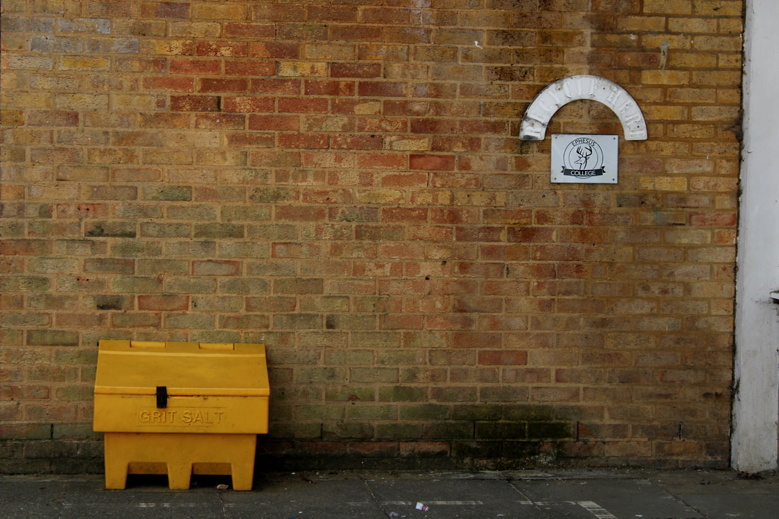
Look up
For my holiday homework, I had to take photos from a low vantage point of different spaces that I was in.


A really interesting breadth of images Will
Best edits

|

|
WWW: my photos are well composed and visually appealing. I have also taken photos in a range of locations to have a large variety of images. I have edited the photos using the rule of thirds, resulting in a better composition.
EBI: some of the images are out of focus, also the light was too dark in some of the photos which could be improved by putting the camera at a higher ISO or a slower shutter speed. Some of the photos look slightly blue because I did not use the correct white balance
EBI: some of the images are out of focus, also the light was too dark in some of the photos which could be improved by putting the camera at a higher ISO or a slower shutter speed. Some of the photos look slightly blue because I did not use the correct white balance
Mirroring & Reflecting
We then reflected some of our images four times to make an abstract image, it gives an illusion similar to a kaleidoscope.
I reflected one of my images four times. Each time there was a different corner in the centre. Which do you prefer and why?
WWW: the images look intriguing and odd, the colour is in a nice balance and the composition is good
EBI: I could have rotated each image slightly to make the lines straight when they are reflected
WWW: the images look intriguing and odd, the colour is in a nice balance and the composition is good
EBI: I could have rotated each image slightly to make the lines straight when they are reflected
Physical mirroring
Composition
- Describe the four composition types, include an example for each one (find it online) and use this to illustrate your description.
|
Rule of thirds is a composition type where you split the image into a 3 by 3 grid. The main subjects of your images should be on one of the lines, or on an intersection. This makes the images more visually pleasing as it directs your eye towards the subject.
|
Balance is similar to rule of thirds, however it (as the name suggests) balances out the image by putting 2 subjects of equal importance on opposite sides of the screen. This importance can either be colour value or size value but the 2 subjects cannot be symmetrical.
|
Triangles composition is where triangles are found within a photo. This is effective because it directs our eye to the points of the triangles without us realising. A triangle with a flat base creates a sense of stability, whereas an upside down triangle makes the image seem fragile.
|
Layers is the final composition type, in this type, the image is split up into 3 sections; the foreground, the midground and the background. This gives the image depth and can purposefully block our view of something of something
|

|

|

|

|
Rule of thirds

Balance
Triangles

Layers

Homework set
Explain the homework and identify the best examples of the four composition types.
I took more photos at home, following the 4 types of composition with animals and objects around my own house. These photos are shown below.
I took more photos at home, following the 4 types of composition with animals and objects around my own house. These photos are shown below.
Triangles
|
Rule of thirds
|
Balance
|
Layers
|
Framing
using mirrors: Sebastian Magnani

In this task we had to use mirrors to reflect things that contrasted with the background. For example it could be light and dark, in focus and blurry, manmade and natural, etc. We based this task on the artist Sebastian Magnani, who "captured the beauty of nature in mirror reflections", as shown in the pictures above.


Best edits
I edited some of my images in photoshop, adjusting levels, contrast, vibrance and cropping the image where needed

|

|

|
WWW: My photos are well exposed and in focus, the mirror is central in most images so the composition looks good overall.
EBI: My photos have little resemblance to the artist's work as the subjects are not selected as well as they could have been, also some of the subjects being reflected are too small or difficult to see. |
Formal Elements
Formal elements are different aspects that make up images. Where in writing you have verbs and adjectives, in photography you have the formal elements.
|
Form
Lines & objects that make something look as if it is 3D 
|
Line
Lines across the screen, usually from man made structures 
|
Contrast
Very different colours that neighbour each other, usually light and dark 
|
Texture
Different surfaces that show different shapes and depths 
|
Pattern
Repeating shapes and/or colours in a regular format 
|
Colour
Bright colours that make the image eye-catching 
|
Tone
A range of lights and darks throughout the image 
|
Unedited Photos
|
First 5 images = colour Next 8 images = texture next 8 images = pattern Next 4 images = tone Next 4 images = line Next 3 images = contrast |
|


Best edits

|

|
WWW: The images correspond to the formal elements, as well as being well exposed and well composed.
EBI: I could not find anything that would be suitable for form. I also think some of my images for contrast and line are less thought through than the other formal elements
EBI: I could not find anything that would be suitable for form. I also think some of my images for contrast and line are less thought through than the other formal elements
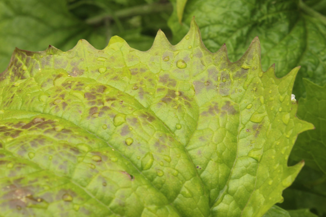
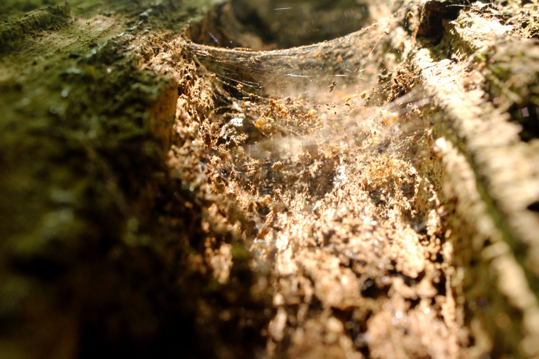
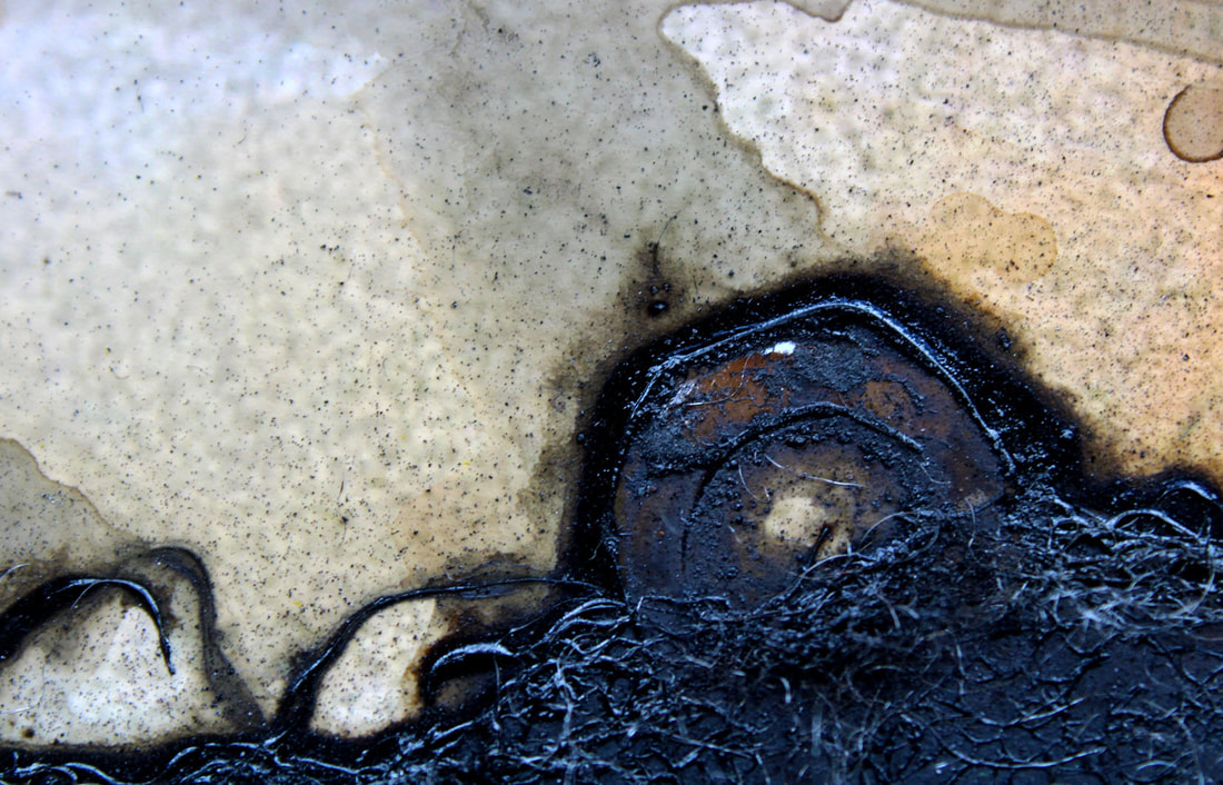
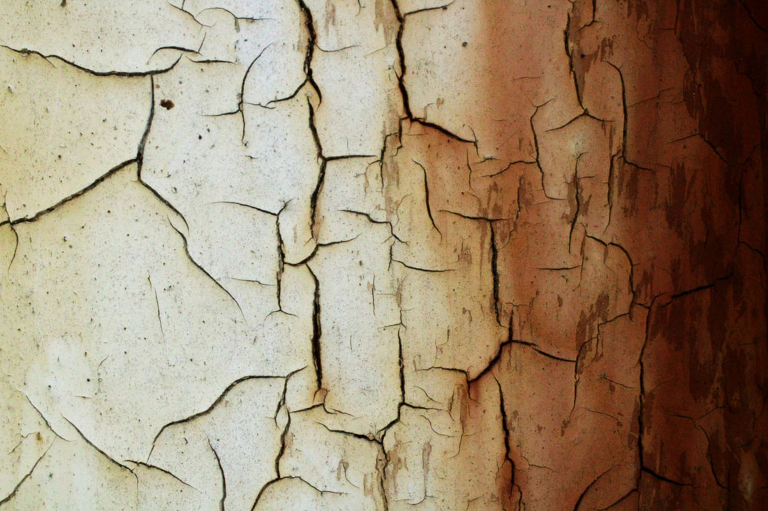
Beauty in Decay

One of Winterbottom's images
In this task, we were required to find structures that had been taken over by nature, or had eroded and rotted due to the elements. This was inspired by Colin Winterbottom's series, 'Elegant Corrosion', where he zoomed into decay to make an abstract image that is nearly unrecognisable. I enjoyed this task because the shapes that are formed in a rotting object make the images look very interesting and cool.
Best edits

|

|

|

WWW: I took images of rot and decay where they look elegant and abstract. The vast majority are in focus and have a good composure.
EBI: Some of the images do not have the desired exposure or the detail has not been captured to the full extent that I wanted.
EBI: Some of the images do not have the desired exposure or the detail has not been captured to the full extent that I wanted.
Independent development
|
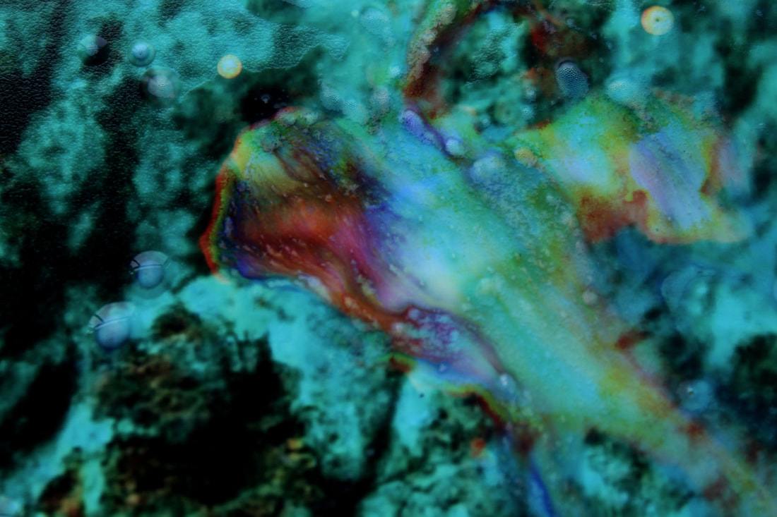
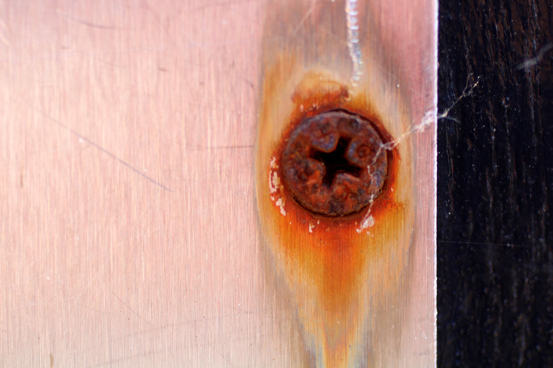
For my independent development I am focusing on Josh Martin. He photographs very close up images of rot, rust and decay, focusing on its colour and painterly quality. He has mentioned on his website that people often think that his photographs are paintings. He takes pride in this, he says that it shows how he has "been successful in taking an unremarkable object or surface, like a scrap of rusted metal or corroding section of pipe, and giving it an unexpected new and colourful life". His photographs support this claim, the images look barely recognisable and this fact makes the images more special when you realise that they are pictures of erosion because we often look over attributes of surfaces when we dismiss it as something ugly or damaged. Martin's images show the beauty and intrigue in these worn down surfaces, as well as make the good attributes the first thing that people notice.
Josh Martin came from a family full of art and photography, so it was always something that he had in his upbringing, however he didn't start by zooming into decaying objects. His previous job was a makeup artist for film and television, and he took photo's around his workplace. The passion for his current photo's started in 2003, when he moved to Seattle after falling in love with the place. He found that after a while his art "focused itself from the Big Picture to the Fairly Small", and he began to dive into the beauty that he found in decay. Now he goes above and beyond, squeezing into gaps in heavy machinery and trekking through scrapyards to produce art. His images are colourful and elegant, with extravagant shapes stretching throughout them. It is clear in his images that he has gone through series' of trial and error to find his calling and produce some purely brilliant images |

|


My first set
I went through Coldfall Wood to take my first set of photographs. I kept Martin's images in mind and took very close up photos of colourful textures that I could see. I tried to make the style of this set as close as I could to the artist's style, for my next set I am going to branch away from replicating his images and begin to develop my own unique images.


Best edits

|

|

|
WWW: My images have elaborate shapes and textures and bright colours. I took I large variety of images which means that I can effectively see which images worked better/worse.
EBI: Some of my images look quite dull because they don't have enough texture. Also because I was photographing quite close up, some of the images are a little out of focus.
EBI: Some of my images look quite dull because they don't have enough texture. Also because I was photographing quite close up, some of the images are a little out of focus.
Second set
For the first development of this project, I wanted to experiment with what I liked about Josh Martin's art. I started by taking more images that look very similar to my first set, just focusing on the texture of rust and decay.


Third set
I then took sets of images where I started from further away and slowly got closer, revealing more detail, texture and colour as I move nearer.
|
|
|
|
|
|
|
Best edits
Fourth set
I finally took images that took images of corrosion and extreme texture and made it look like images of alien planets and peculiar landscapes.
Best edit
|

|
WWW: Some of the pictures, especially the best edit, very closely resemble fantastical landscapes and are composed in a way that makes them look much wider scale than the images are.
EBI: My judgement as to which surfaces would look like environments could improve as some photos aren't as pleasing to look at. Furthermore I should have taken a larger set of images to get a bigger idea of what worked and what didn't
EBI: My judgement as to which surfaces would look like environments could improve as some photos aren't as pleasing to look at. Furthermore I should have taken a larger set of images to get a bigger idea of what worked and what didn't
Fifth set
I destroyed printed out photographs from my first set. I did this because it adds another layer of colour and decay which makes some very interesting and colourful images. I used bleach to destroy the surface of the print.


Best edit
WWW: The bleach lifts the colour off the page, making some fascinating shapes and gradients on the page, after the bleach is wiped away, the blank spots look supernatural and fire like, giving the photos a really intriguing effect.
EBI: I could have composed some of the images better, also using the macro lens would have made the shapes and colours even better.
EBI: I could have composed some of the images better, also using the macro lens would have made the shapes and colours even better.
Part 2
To continue with the decaying of printed out photos, I put steel wool with rusty objects on a photo and covered it in water and coffee. After a few days I washed the photo and patterns had developed on the surface. The rust made very intricate designs that made for some incredible photos.
Best edit
WWW: Some of the textures are complex and visually pleasing, matching the textures in the original photograph
EBI: The photos lack in colour and some of them are quite dull or just out of focus, causing the set to not stand out compared to the other sets
EBI: The photos lack in colour and some of them are quite dull or just out of focus, causing the set to not stand out compared to the other sets
Experimenting with the macro lens
I used the macro lens to take incredibly close up images of colourful surfaces of decay. The images ended up too large for weebly, so I screen-shotted the page where I could view all the thumbnails at once.


Best edits
|
|
WWW: The photos are intricate and well composed, some are barely recognisable as the objects that they are
EBI: Some images are slightly out of focus, and some surfaces are not as interesting as I thought they would be.
EBI: Some images are slightly out of focus, and some surfaces are not as interesting as I thought they would be.
Final set
Part 1
For my final set, I want to take pictures of everyday textures and surfaces and make them special and almost unrecognisable by repurposing them into looking like fantasy landscapes. However, this differs from the first time I did this because I will take the images using a macro lens.
Part 2
This was going to be my last set, but I repeated the same task as I wanted to take more colourful and interesting photos, I prioritised interesting colours and textures, also trying to make them look like broad environments.
Best edits


WWW: The photos are interesting and well composed. Some are colourful and effectively resemble landscaped. The vast majority are in focus.
EBI: A proportion of the images are under exposed and the lighting in all of them could be better to give the pictures more of a fantasy tone. A lot of the images put more emphasis on the textures of the surfaces instead of making them look like mini environments.
EBI: A proportion of the images are under exposed and the lighting in all of them could be better to give the pictures more of a fantasy tone. A lot of the images put more emphasis on the textures of the surfaces instead of making them look like mini environments.
Best images so far

|

|

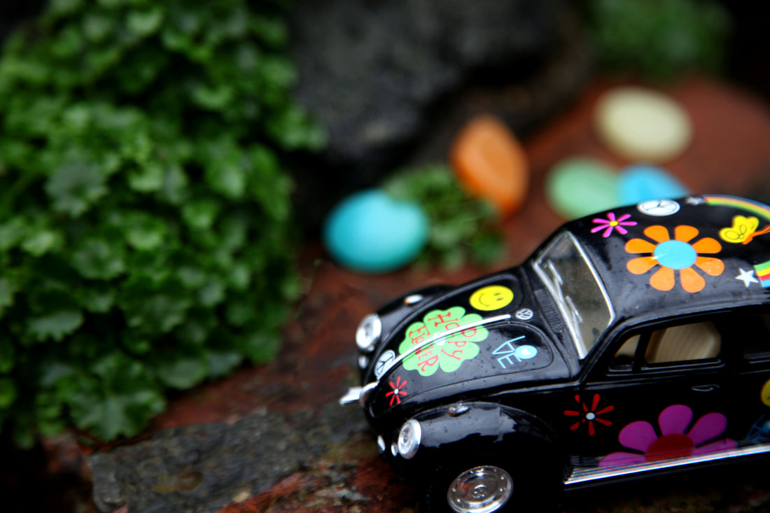
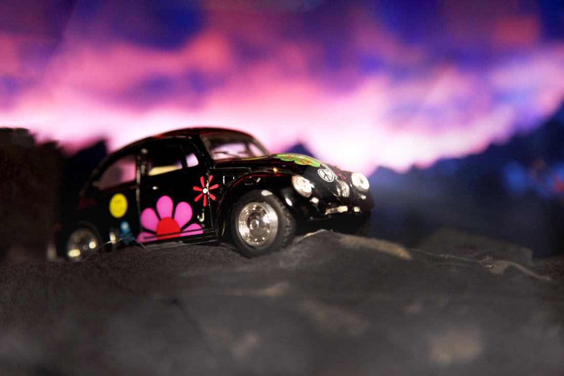
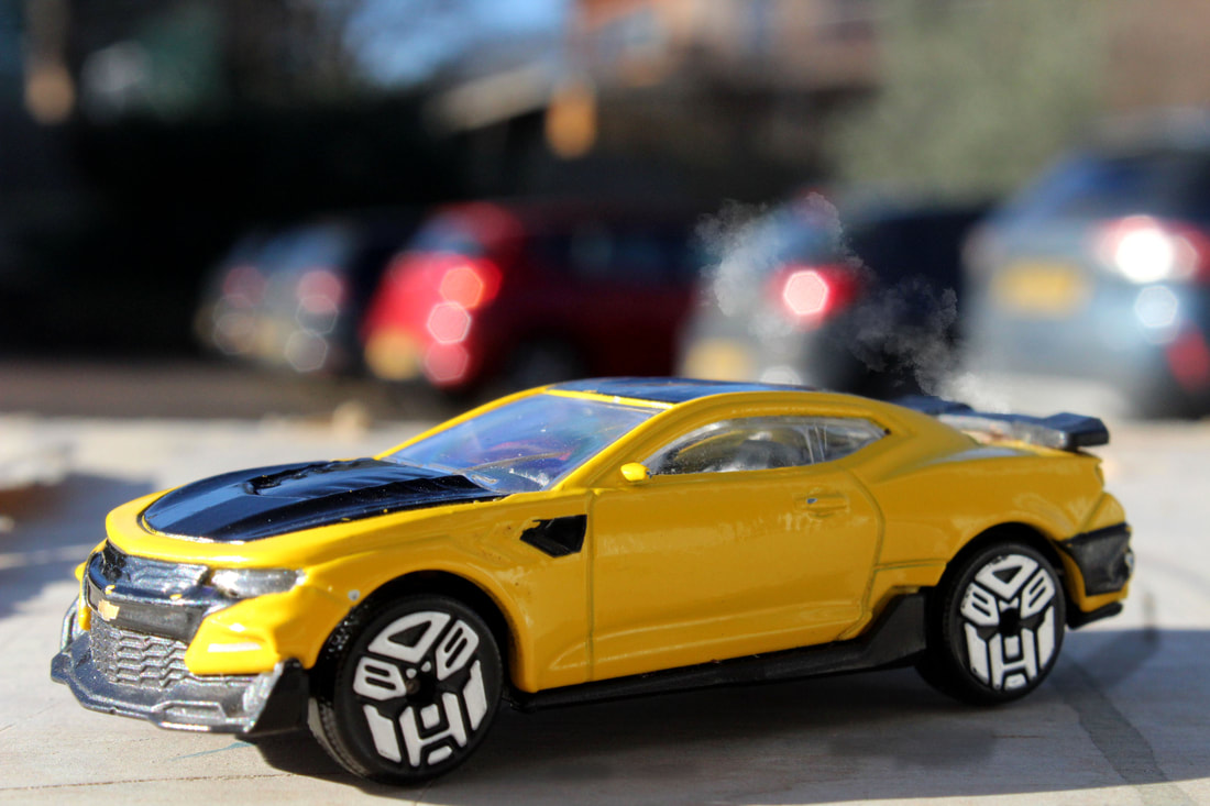
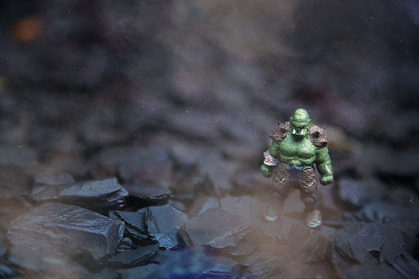
I like how the images focus on a surreal miniature environments, making a tiny scene but I found it quite limiting and difficult to convince the viewer of the scene. I want to expand by adding a narrative element to the images like the artist Felix Hernandez
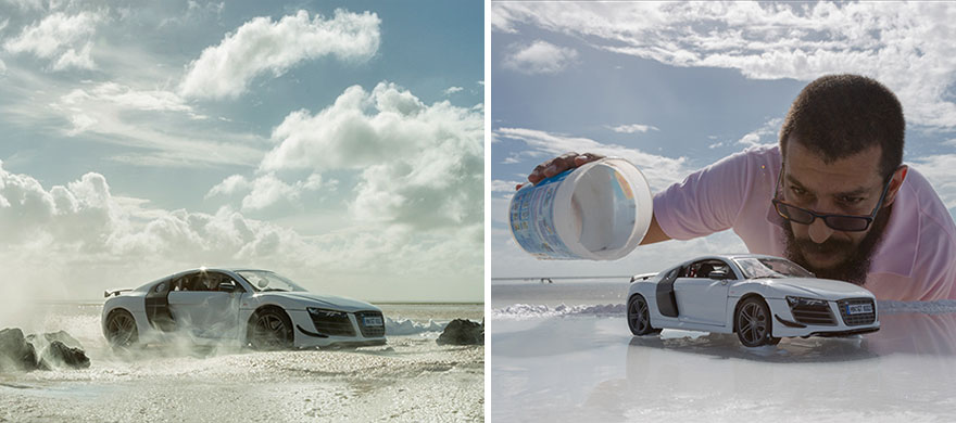
Felix Hernandez
|
|
|
Felix Hernandez names his studio "Hernandez dreamphography" as he creates a world of wonder through his photography. He produces a lot of his work for advertising campaigns, but also creates any fantastical scene he can imagine. His images are lifelike, making them believable, but with an element of fairy tale that makes them impactful and intriguing.


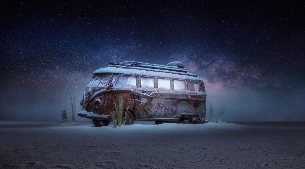
Best edits
To replicate the style, I overlayed fog on top of the images and tried different techniques in photoshop, for example different lighting techniques and background styles.
|

|
|
|
|
|
Final Pieces
|
|
|
